Monday, October 27, 2008

Fishtank

fishtank_test-2

Settings: Ambient light is -3 stops below neutral grey. Green rim light is +1 stops, and Main fill is +1 stops. Rim light is from the right, through the fishtank, slightly behind the subject but aimed toward subject head. Fill is snooted and aimed directly at head, and is forward from subject and to the left (of camera).

This was a quick test over the weekend for a shoot I have coming up. I wanted to be more familiar with the setting, what works, and what doesn't. The main worry of mine, was that I wanted a flash coming through the fishtank to use as a rim light. It took some experimenting to get it to work. First I tried putting the flash on the opposite side of the tank pointing forward, but that created too much flare, and didn't give me the rim light I was looking for. Then I put the flash on the right side of the tank, and aimed it forward. This gave me the rim light that I needed. Now it was a matter of balancing ambient and the main flash.

On the above photo, the green light on the right side of my face is the rim light from the flash aimed through the tank. Even though the flash was at 1/1 power, and full 105mm zoom, I had to bump the ISO up to 400 and drop my aperture to f/3.5 in order to get that rim to the brightness I wanted. This was my hard point around which all other settings had to revolve, because this was the only option that worked.

Next, I figured out my ambient level by opening the shutter till it was where I wanted (I almost always start at 1/250 shutter when using flash) I wanted the ambient to remain dark, so it's about -3 stops from neutral grey. I had a few with it opened up more, but it was not enough contrast for my taste, and the fishtank started to blow out.

Now that I had my ambient balanced with the rim light, I needed my main light. I started with it at 1/128 and 105mm zoom, aimed directly at the head, but this was still too bright. The face where it hit was completely blown out. Since the 580ex doesn't go lower than 1/128, and I didn't have any ND filters with me, and the other settings were already anchored down, I only had one choice, and that was to start backing the light away from the subject. Every time the distance doubles, you get 1/2 the light. The more I backed it up, the more of the subject that would be lit, and I wanted it restricted to just the face. I popped on my grid-spot, to constrain the light to a tighter beam, and that did the trick. I got my main, ambient and rim all balanced in a way that worked.

After shooting, there was some cleanup. I had an unsightly shadow on the right from the snoot, and some junk in the fishtank that didn't add to the composition. This is where Photoshop comes in.
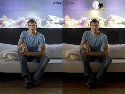


First, I boosted the shadows a bit. I could have gotten this by opening the shutter another 1/3 stop when I was shooting. Next, I cooled down the white balance of everything but the subject's skin. Then I removed the shadow on the couch and grey fishtank, and then cloned out the junk in the fishtank itself. Finally I used highpass and smart sharpen to bring a little extra medium and micro contrast to the face and hands.

Now I feel prepared to do a more elaborate shoot in this location based on this experiment. The majority of the problems have been solved, and I'll just have to concentrate on composition with a group and directing my subjects. If I'd left these technical aspects till the shoot itself, I would have either frustrated my subjects with all the back and forth, or I would have rushed myself and not gotten the result that I wanted.

Thursday, October 23, 2008

Kitty Cowboy

kitty_cowboy-4

This was an incredibly fun shoot, and came together so well for such a last minute thing. Some of it was luck, but also just developing a shooting style that works fast and furious and being really comfortable with my gear helped a ton. Because of how cold it was, I had my lighting stands already assembled with umbrella swivels attached, flash attached, and skyports velcroed and plugged in. This let me start shooting within about 5 minutes of arriving to the shoot location.

The settings for these was fairly simple, and I'm going to follow David Hobby's advice and stop listing details and start listing the useful information.

Camera was set to about -2 stops from ambient (meaning the sky was about middle grey, and the model was almost black with no flashes)
Flash one was set to +4 stops from ambient, and flash two was set to +2 from ambient level. This means flash two was making sure the model was properly exposed, and flash one was giving me some bright rim light.

I started by shooting without flashes, and getting my sky at the exposure that I wanted, ignoring the model. Then I raised one flash stand to full height, and one to about waist height. I was planning to use the tall one for my bright rim light, and the low one for fill. As I shot, I was constantly repositioning the flashes to work with the pose and setting. This is where having light, easy to relocate light stands was a real benefit. Every time I wasn't happy with the light position, I just picked up the stand and moved them. No cables, no weights, no light mods to worry about.

kitty_cowboy-2

For this one I wish I had lowered the output of the secondary flash (the one on the left) so that her face wasn't lit so evenly, but it worked out alright.

kitty_cowboy-1

These old gears were too awesome not to use as a prop.

For these shots, I tried using my flashes "un gelled" meaning they were pure white. This way I can color correct afterwards. It takes a bit more time, but I was finding that I was doing this even on my gelled shots to match everything just the way I wanted. This makes it faster for me to not have to use and balance gels, knowing I will do the correcting at the end.

I also placed the stronger light always in the same direction as the sun light was coming, so that it would look more natural. I think in the first shot, it isn't completely apparent that flashes were used, which is a look I'd like to be able to control on command.

There are more shots in the remainder of the set.

kitty_cowboy-3

Monday, October 20, 2008

Tunglið and Spheres

haukur_tunglid-3

Settings:
2x 580ex II
Main flash at 1/128,
at 105mm zoom,
light stand at 2 meters height,
2 meters to the left and 1.5 meters forward from subject,
Rim light at 1/128,
at 105mm zoom,
light stand at 1 meters height,
2 meters to the right and slightly behind subject.

This weekend I did two different shoots, one outside and one inside. My main goal was working with bare lights and trying to come up with flattering positions for them. I feel like I've learned a bit more how to use them, but I'm also realizing there is a limitation as to how flattering you can make bare flashes, especially outdoors where the ambient is low. The next few weeks I'll be investigating how I can soften the light while still having some good throw.

haukur_tunglid-2

Settings:
2x 580ex II
Main flash at 1/128,
at 105mm zoom,
light stand at 2.5 meters height,
3 meters to the left and 2 meters forward from subject,
Rim light at 1/128,
at 105mm zoom,
light stand at 2 meters height,
3 meters to the right and even with subject.

For these, I knew I wanted to do a shoot with this subject, but wasn't 100% sure on the location. However driving to his house, I saw how great the moon was over the distant mountains. Ideally I would have arrived about 30 minutes earlier and it would have been a lot nicer with a higher ambient light level. Even with the flashes to freeze the subject, I would have liked to have had a tripod with me to help use even slower shutter speeds, especially with the sitting shots, as I used an 85mm zoom lens for those. There were already lights present for the ship statue, and they illuminated the subject enough to cause blurring with shutter speeds any slower.

agust_double_balls-3

Settings:
2x 580ex II
Main flash at 1/128,
at 105mm zoom,
through gridspot,
light stand at 2 meters height,
directly in front of subject 1 meter away aimed at his face,
Rim light at 1/128,
at 105mm zoom,
light stand at 2 meters height,
1.5 meters to the right and 1.5 meters behind subject.

For this, I wanted to utilize these glowing ball lamps that I had. It didn't turn out quite how I envisioned in my head when I wanted to do this shot, but it was still fun and gave me practice. I started by placing my camera on a tripod to the height and angle that I wanted. I then positioned the light spheres so the fit into the frame composition how I wanted. I placed a backpack in the position that the subject's face would be, and arranged my flashes so that I could determine placement and power. The front flash had a grid spot on it to confine the flash only to his face.

Once I had the placement and power of the flashes, I was able to darken the ambient by increasing the shutter speed to 1/250. If I had wanted to decrease it even more, I could have changed to ISO 100, increased power to both flashes by 1 stop, and left shutter speed and aperture the same, and the ambient would have been one stop darker.

More from these two sets:

haukur_tunglid-1

agust_double_balls-4

Friday, October 17, 2008

Clamshell lighting

clamshell-2

I saw a few medium format portraits yesterday that had a beautiful creamy depth of field to it, and I wanted to see if I could emulate it with my camera. I feel like I got close with this.

Here is the setup shot:

clamshell-1

Settings:
2 Canon 580ex II
Top flash at 1/32 power,
at 24mm,
into silver bounce umbrella
light stand was at 1.5 meters height,
directly in front of subject and angled down,
bottom flash at 1/64 power,
at 24mm,
through white shoot-through umbrella,
light stand at .3 meters height,
directly in front of subject angled up.

The lower flash was essentially 2 stops dimmer than the upper flash. It was dialed down one stop, plus the white umbrella eats an extra stop of light than the silver. The result is a very smooth lighting with a little direction from above. These low settings of 1/32 and 1/64 in a dark room allowed me to use f/1.8 which is how I got such a smooth and strong fall off of focus. I tried it with a background slave flash set, which illuminated the background, but that washed out the nice focus, so I turned it back off.

For post, I adjusted contrast slightly, and clarity slightly, desaturated a little. Then in Photoshop I added a +.3 exposure to just the eyes, and then used highpass and smart sharpen, but with masks to limit it to just the part of the image that was in focus, so that I wasn't sharpening the out of focus areas.

clamshell-3

Tuesday, October 14, 2008

Kirkjuljos

The title of this post means Church Light in Icelandic.

kirkjuljos-4

I saw this church several weeks ago at night, and knew instantly that it would be a perfect setting for a shoot. I had several friends lined up to ask to help pose for the shoot, but either my schedule or theirs precluded it. After buying a new jacket and wanting a way to show my friends, I figured I would do a trial run with myself as a the model. A bit more difficult, but this way there was no rush.

I did a bit of planning beforehand in my mind, I knew I wanted to:
Use symmetry as a framing element,
Use the running lights of the sidewalk to draw the eye in,
have the entire church visible,
have a contrasty dark blue sky,
and try not to overlight it.

My first step was to get a good angle and decide on a lens. Originally I tried my 10-20mm, but it was far too wide, and it's minimum aperture at 20mm is 5.6, which was horrid for the lighting conditions. I knew I needed my 35mm f/1.4 to pull in enough light. I set it up on a tripod and got a good angle, then using my remote trigger, I tested at which running light I should be even with for proper framing. Then I used the live view to fine tune the focus onto that running light, and locked the lens to manual focus. At 1.4, the DoF is incredibly narrow, about .4 meters.

Once I had the angle I wanted, I wanted a photo using natural light only, so I could try to emulate it. Here is a photo with no flashes used.

kirkjuljos-1

It's not a bad lighting scenario, but the lights are heavily tinted (streetlights) and not bright enough. I setup my flashes so that they sat at the same angle as the streetlights, and angled them up so that it would feather downward and not create a glaring shadow at my feet.

Here is the setup shot:


Settings:
2 Vivitar 285hv
Right flash at 1/16 power,
at tele zoom,
angled up,
light stand was at 1.5 meters height,
left flash at 1/32 power,
at tele zoom,
angled up,
light stand was at 1.5 meters height,
5 meters to right of subject 3 meter forward from subject.

In hindsight, I wish I would have used CTOrange gels. I had to fake it in post with a photo filter in photoshop, as the lights were far too blue when I balanced for the rest of the scene.

Once I had the lights the brightness that I wanted, and a good angle, I poured water all over the sidewalk (I had brought a 2 liter bottle of water) in order to get some reflections off the ground to add more lighting interest.

kirkjuljos-3

For post settings, I took the sky from the first shot, and used it for all the subsequent shots. It started getting cloudy after that shot, and the sky was just a flat orange from the city lights bouncing off the clouds. I edited the curves of the sky layer to bring up the blues and greens in the highlights, and the reds and blues in the shadows. Then I balanced all the light sources. I used a warming filter for the subject to kill the blueish cast of the flashes, a magenta filter for the green flourescents of the church lights in the background on the ground level, and a color correction layer for the sidewalk to remove the magenta cast of the WB correction that was used on the entire scene. If I'd used CTOrange gels, I would have had one less light source to correct in post. Then I used the high pass method of sharpening, but limited it only to the subject, and the ground that was in focus. I used this same mask to smart sharpen as well. I think bokeh becomes incredibly ugly when sharpened, so I leave it out of that step.

Once I had everything setup, I could just stand there with my remote trigger and try a bunch of poses, trying to think about how the flash would fall on me based on the angle I was standing, and also thinking about where my weight was distributed, how my stature and posture would make the final image look, and making sure to straighten any wrinkling of my clothes from those poses. It would have been great to have had a stylist on hand, but you work with what you have!

kirkjuljos-2

Sunday, October 12, 2008

Fashion shoot

fashion-3

A friend of mine, Sruli Recht is a tailor and shoemaker, and he routinely asks me to shoot his products for his website. Above is a jacket he´s made, and underneath is a protective brace. Some people have ribcages that will pop out of socket if not held in, and this brace does just that, but it´s a designed product from a tailor, rather than a medical product.

Here is a shot of just the brace:
fashion-2

Settings:
2 Vivitar 285hv
main flash at 1/4 power,
at wide zoom,
into silver 43" bounce umbrella,
light stand was at 2 meters height,
1 meters to right of subject 1 meter forward from subject,
2nd light was at 1/16 power,
at wide zoom,
2 meters to subject left, and .5 meters forward from subject,
at 1.5 meters in height.

Unfortunately I forgot to take a setup shot, however it was very simple. The background is a plain piece of cloth, and both lights are basically at 45 degree angles aimed at the subject. this eliminates the shadows on the back wall, and creates a very even lighting. However the fact one flash is bare, and one flash is using an umbrella, gives a nice difference in quality of light from one side to the other. One side has soft, broad lighting, and the other has a bit harsher, sharp lighting. I will definitely use this type of setup in the future. I was working right at 1/250 to kill as much ambient and darken the shadows as much as I could, since this cross-lighting would otherwise create a too-even lighting if the ambient was allowed to leak in.

Here is an angle that shows how hard the left light was, based on the hard shadow line from his nose across the cheek. The edge of the cheek shows the soft falloff from the right flash. The other nice part of this lighting setup, is the subject could rotate freely with no need to adjust the lights.

fashion-1

I ended up doing quite a bit of post on these shots. Mainly to adjust the subject's physique.

before_after_02 before_after_01 before_after_03

I started by using the warp and liquify tool to readjust the main proportions, then I quickly cloned out any skin imperfections (which there were very few), and then proceeded to use the dodge and burn tools to add in muscle definition. I finally used a regular brush with a flesh color, set to saturation, to add back in the color that dodge and burn tend to remove. Finally, I enhanced or added in catch lights to the eyes to make it feel more vibrant.

Tuesday, October 7, 2008

Subtle Lighting Practice

subtle_practice-3

One problem in my work is that I sometimes overlight the scene, completely obliterating the existing light. This is fine in some situations, but I also want to be able to recreate more natural lighting, and avoid the "CG" look (computer generated). To try this, I used my excellent model, Agust, and setup around him while he was working on the computer. This way I could try many different setups without having to worry about the model becoming bored or wanting to leave.

First, I wanted to capture the existing lighting as best as possible. This was hard to do with the low light in the room. It required ISO 1600, 1/60 shutter speed, and f/1.8 Those settings are toeing the line of what my camera can do. Any slower shutter and I'd get blur, the lens can't open up wider, and the ISO doesn't go higher.

subtle_practice-2

There is a very bright lamp to the left and behind the subject, creating the strong rim light. The laptop is throwing a bit of blue on his face, and the lamp is bouncing around the room off the white walls for the fill. It's an ok portrait, but I wanted a bit more control over the colors of the light, so that the main portion of the face could be more neutral, and I wanted to bring the camera settings up. I wanted a lower ISO for less noise, faster shutter to kill ambient and avoid any blur at all, and a slighly higher f-stop for a bit more of the face in focus.

Here's the setup shot. Click through to see notes on the flashes.

subtle_practice-1

Settings:
2 Vivitar 285hv and one Morris slave
main flash at 1/16 power,
at telephoto zoom,
bounced off the wall and ceiling,
light stand was at 1.5 meters height,
2 meters to right of subject and even with camera,
rim light was at 1/1024 power,
through 3/4 CTOrange gel
at telephoto zoom,
.3 meters to subject left, and slightly behind,
at 1 meters in height,
Morris slave at 1/2 power,
through 1/2 CTBlue gel,
sitting on laptop and aimed at screen to bounce.

The first shot of the post has the morris slave turned off, which results in a more contrasty shadow of the face. However I wanted to try also with a bit of "blue glow" to emulate the screen. I was operating way too high above screen brightness for it to show up, which meant I needed to break out my slave flash. It's quite dim, and only has full and half power, but it worked great for this purpose. I put it on the laptop palm rest and aimed at the screen to get it to bounce. An unforseen, but added benefit, is the nice bright marks on his glasses, which is the flash bouncing off the icons of the screen. This final shot shows the same setup, but with the morris flash turned on.

subtle_practice-4