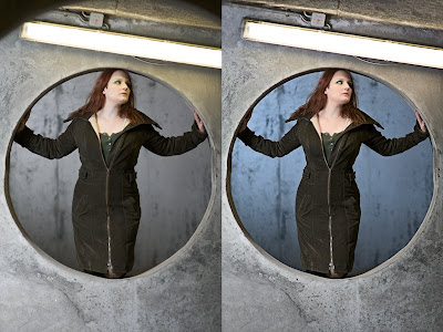
Settings: Ambient is 1 stop below neutral grey (other than the lighting fixture itself, which is 3 stops above) Main flash is into a 61cm umbrella at 1.5 stops above neutral grey. Secondary flash is aimed at the wall behind the circular opening, and is about .5 stops above neutral grey.
Several weeks ago, I passed a really interesting covered parking garage here in Reykjavik. I knew instantly that I wanted to use it as a backdrop for a photoshoot. The concrete and the long lights provided so much interest, and would contrast really well with a subject. In my mind, I wanted to do a full body portrait with a lot of the garage showing, but those shots didn't turn out so well. It was all the impromptu posings and backgrounds that worked best.
This was actually the final area/pose of the evening, and I think it worked best of all. I saw the circular opening, and knew I wanted to use it as a framing element. I asked her to stand inside it and put her arms out. The first several poses had good compositionl, but the way the light fell on her face wasn't very flattering. I took some time to examine the back of the screen, and asked her to move her head a bit forward so that more flash would reach it. This is one of those times where sticking to the shoot and asking for more, to ensure you get the right shot.

The post processing was actually quite involving, but because I felt there was so much potential to be had. Lately I've been shooting all my flashes ungelled, and color correcting in post, because I ended up doing that anyway to get the right colors, and this way I save time from having to bother with the gels. The first thing I did was to clone out the other circle in the top. It sucks because had I noticed it at the time, I could have reshot crouched just a bit lower, and it would have been gone. Once I had a clean plate, I used the liquify tool to slenderize her arms and waist a bit. The coat was extremely thick and killed her curves. Next I used the magic lasso tool to make a quick mask for the background, and used the cooling photo filter in photoshop. Then I made a custom white balance layer to subract the yucky green color from the flourescent lamp. I had to custom paint that mask onto her face and the concrete in order to remove it correctly. I liked the lamp a lot for what it adds to the composition, but the disgusting green had to go. Finally I used a slight warming filter on her skin to give it just a bit of warmth. Once the photo was where I wanted it, I used my typical high pass and smart sharpen combo to add some more micro contrast, but masked it away from everything in the face, other than the eyes, and edges of the nose. Female skin works well soft, so I left it that way, but eyes tend to look good with some sharpness.
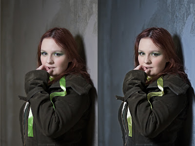
Settings: Ambient is 2 stops below neutral grey. Main flash is into a 61cm umbrella at 1.5 stops above neutral grey.
This one is the result of a technique I've been trying lately with models. I asked her if there was any pose she was interested in trying, or thought would look good. She suggested having her hand by her mouth, and it worked out great. It took a few times of arranging the light till I was happy with how it fell, but I really like the final.

For the post on this image, I cooled the background, reduced the neon green of her ribbon, and tucked in the front of the jacket, and jacket sleeve. The shadow from her back made her look unnaturally wide, so I used an exposure layer to bring up the edge of the jacket and sleeve a bit, as if there was bounce light from the wall. I also fluffed up her hair a bit using the liquify tool.
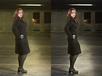
Settings: Ambient is 1.5 stops below neutral grey. Main flash is into a 61cm umbrella at 1.5 stops above neutral grey to the right and in front of the subject, above head height. Secondary flash is zoomed to 105mm and through a gridspot, aimed at her head so that it only hits her hair. The secondary flash is about 2 stops above neutral grey.
This one is closest to my original mind's eye image of the shoot. I used a classic female pose, found on a 70's tutorial somewhere, and it helped, as originally she wasn't 100% sure of what pose to assume. We tried several, but I think this one was the most feminine and confident looking.

This one took the most time in post. Immediately I used liquify to remove the effects of the thick coat. During the shoot I asked if it was possible for her to angle her arm back in such a way that I could see a triangle of the wall between her elbow and the small of her back, as that's a very feminine aspect of the body. It was too constricting of a coat, and too uncomfortable of a position, so I added that part in photoshop. I cloned a bit of wall in to look like you're seeing through, then darkened the coat to make it look as if it really ended there.
Next I adjusted white balance on everything, neutralizing the green of the ceiling lights, and warming her face just a bit. I used a curves layer to add a lot more contrast to the background, and then used a technique from the Platon copy that I did. I used the mask of her figure to create an exposure layer, that darkens the image in a halo around her. It's only by about .4 stops, but it emphasizes her silhouette more and brings attention to her as the subject, allowing the background to fade away.
It was a great shoot, and many thanks to Chantal for being a lovely, willing model, and to Árnór who assisted.


This comment has been removed by the author.
ReplyDeleteGreat shots, I love that parking garage! My good friend Lina Hansson (www.fromamouth.com) actually shot my album cover photos in the same place..
ReplyDeletehttp://i61.photobucket.com/albums/h51/ElskanMinn/MannyElskanMin.jpg
Awesome Manny, I like that image.
ReplyDelete