Monday, May 31, 2010

mexican_lights

mexico_self-1

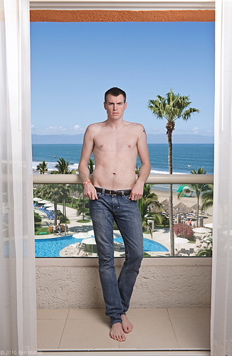
Settings: Background is properly exposed, flash into 1.5 meter softlighter II to camera right, with the light meter at face level powered to expose properly.

Agust and I went to Puerto Vallarta, Mexico last month. I actually lugged all of my studio lights down there for a photoshoot that didn't really pan out, but I went in knowing that might be the case. I made sure to use them anyway. The above photo used just the 1.5 meter softlighter. One problem is that the outside and inside are such different light types, the outside being harsh sunlight, and me being lit softly, that it looks composited or cut out. The fact they are even in brightness and focus is also contributing. This was intentional, as I wanted the outside to be clear and well lit to show just how nice the hotel and our balcony view was. In addition, it was unavoidable without neutral density filters. to properly expose the outdoors while staying under my sync speed (1/160), I had to go to f/11. This means that foreground and background on a 35mm lens (what I used) would be sure to be both in focus, even with the extreme distance from subject to distant background. If I did want a blurry background, a neutral density filter over the lens would let me increase the aperture. This is also a reason I'm glad I have the power of the Quadra, as I needed about 3-4 hotshoe flashes worth of power to equalize subject and background.

One thing I could have done, and did do for a later shot, is add a rim light. By adding a hard rim light, it reads visually as the sun coming onto the subject, which unifies the lighting, making for a less composited look.

agust_mexico-3

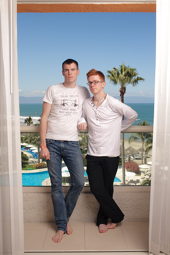
Settings: Background is overexposed by half stop, flash into 1.5 meter softlighter II to camera right, with the light meter at face level powered to expose properly. 2nd flash through reflector with 20 degree grid behind subject to camera left, also properly exposed.

This blends much better with the outside exposure. The slight over exposure is what you expect from looking out a window, and the harder rim light feels like it could be the sun hitting the subject's head.

With both of us in the image, I wanted to use the window and blinds as framing elements, to show that it's on a balcony. This served as our vacation snap from the trip, and while I knew it would look partially cut out with both fore and background perfectly lit and in focus, I wanted both subjects to be prominent and clear. By using such a large source, I was able to keep it a little back and still get soft light, ensuring both of our heads would be the same exposure despite being different distances from the light. (the closer the source is, the more affect different distances from the light will have because of falloff. If the light was only 20cm away from the closer subject, 20cm between our heads would make 40 vs 20cm, for half the light, but with the light 2 meters away, it was 2 meters vs 2.2 meters, such a small difference as to be unnoticeable)

b&w-1.jpg

Post was minimal. Some contrast adjustments, and bumped both the blue and green colors so the sky and trees would pop a bit more.

Tuesday, May 25, 2010

red_heads_series

red-1

Settings: Main light through a 1.5 meter softlighter, and is metered to proper exposure at his face. 2nd light is behind a white diffusion panel, aimed into the camera, and meters also at proper exposure.

From the numerous shots of my husband, one might be able to ascertain my affinity for red-heads. I find the features fascinating, the trending toward pale skin, freckles, what the light colored eyebrow hairs do to the reading of a face, and the often green eyes. I just think red headed people are fascinating in their anatomy, skin tones, and differences from the rest of the pigment gamut. I decided to put my fetish toward a new photo series. One might think I'd start with my husband first, but I had an opportunity to shoot a stranger first, more shots will follow in this series.

The lighting goal was to keep the focus on the features. Soft, revealing light, and a pure white background so as not to distract from the features. I kept a slight falloff of focus to give it a sense of immediacy. An all in focus image would have been a bit too clinical. I used my 85mm lens to make sure there wasn't any distortion of the facial features, and a benefit is that at f/3.5 this lens is nearing it's ultimate sharpness, giving crystal clear sharpness to the details in focus.

To achieve this lighting, I used 2 lights, and to get a pure white background, I used a very convenient approach. The first light is in my giant 1.5 meter softlighter, directly over the camera and about even with the lens, placing camera and light about 1 meter from the subject, with the light raised above and aiming down. This provides soft even lighting with some volume from being raised. If it were even with the camera in height, the light would be more flat. Now the kicker, is the 2nd light. I have one of my 1x2 meter panels with diffusion material behind the subject about 1 meter, and the 2nd light is behind the panel aiming back through. This means rather than trying to evenly illuminate a white paper backdrop, I'm lighting up a diffusion panel from behind. This is similar to the lastolite popup white background, but works with my existing equipment. By keeping it a bit behind, I avoided flare. If you pump too much light off or through your white background, you can create a contrast reducing flare. I used the B head from my quadra, so it's half the output of the main light, but since the diffusion panel eats up less lighting than the softlighter, they are even in light output. This results in a proper illumination of the face, and since the diffusion panel is white, proper illumination of it ends up with solid white background.

Post processing was mainly to remove a few tiny blemishes, and really enhance the contrast. I wanted to avoid an over baked look, but really get some details popping. This resulted in a lot of back and forth between curves, and then fine tuning the saturation sliders to make sure the shadows didn't go too burnt in redness. I toggled between color and black and white a lot to make sure I got the full range of contrast, this is more evident in B&W, so by changing over to that you can see how your value range is, then switch back to color to make sure the saturation levels work with your adjustments. The other really important thing is White Balance. Skin tones and hair color is really important for this series, so I had to be absolutely sure of color neutrality. One thing I love about my Quadra is it's color consistency at all power levels, but working on a color calibrated monitor was pivotal to making sure it was perfect.