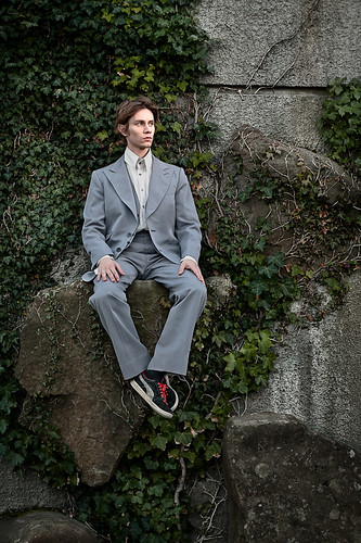
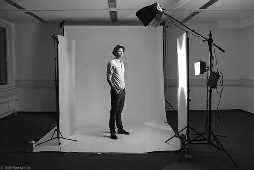
Settings: Ambient is underexposed by 1/2 stop, and face is properly exposed using a small gridded softbox just outside frame left.
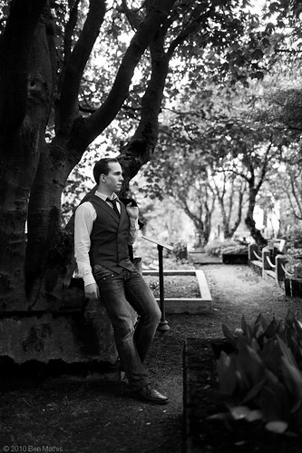
I saw this location when walking back to work from a coffee shop and knew I had to do a shoot. Their are boulders embedded in the wall, and ivy growing along the side. many of the boulders are high enough I knew I could crop out the ground and remove the sense of how high it was. I asked a friend to sit for me, and asked him to wear a suit. He told me he only had an older ill-fitting suit, but knowing his look, I thought it might work. He showed up in these ratty shoes, and at first I was a bit disappointed, but I think they work with the look. Newer shoes would have shown how disheveled the suit is.
Lighting was simple. I set my camera on a tripod and got the framing I wanted. At first I was using my 85mm lens to flatten everything, but I wanted to see a bit more of the wall, so I switched to my 50mm, which let me go closer and keep him larger in the frame while still showing a lot of the wall. Once I had that setup, I underexposed by 1/2 stop, set my small gridded softbox to the full 3 meter height of my light stand, and aimed it at his head height. I used the light meter to power the flash so it was properly exposing the face. This would give me a bit of focus on the face, without too much of a light intensity difference.
Once that was set, it was just a matter of getting a pose and expression I was interested in.
This image shows the before and after of the post work. I found the image overall was a bit too bright, and the wall lacked volume because the day was fairly overcast. I used the adjustment brushes in lightroom to make the top edges of the boulders pop, and another to deepen some of the undersides of ivy and boulders. Then I took it into photoshop, gave a bit of white sleeve to his left hand so it would look more balanced, then underexposed the whole image another small amount while leaving the face untouched. I cloned out the few small imperfections on the face not visible at this resolution, and went through my normal sharpening procedures to give more micro contrast.
Too long since a post, so I'm going to do a quick one based on some thoughts I've had this week from speaking about gear in a few forums. I have a shoot coming up this week I will post more real photography on, so never fear.
As photographers we can really get caught up in gear. It's so easy to believe our inability to improve is related to the equipment we own, when in reality the cheapest digital camera is in many ways better than high end cameras of yesteryear. We are limited only by our skills. I have lately forced myself, whenever I get bitten by the gear-bug, to instead of researching or pouring over online catalogs and reviews, to plan a photo shoot idea, and go out and shoot instead. Practice, a photo trip, or a new book (be it instructional, or inspirational) will do far more for our skills than a new piece of equipment.
That said, I want to lay out what I think the basics are, in case you don't have a kit yet at all, or in case you are wondering if there truly is a limiting factor on your current gear. This is assuming you shoot in a similar vein as this blog, mostly portraiture where you control the model placement and can zoom with your feet. None of this will apply to bird photographers or sports journalists.
A camera with wide, normal, and tele lens options.
A light source of some type with at least one constraining option (like a snoot) and one softening option (like an umbrella or softbox) and a way to trigger it.
Wide for me is 35mm, but some people like 24/28mm.
Normal is between 45-60
Tele is over 70, and for me is 85
The reasons for this is your composition. You can keep your subject the same size between wide/normal/tele and totally change what you see in the background. When you want a sense of location, you use wide or normal, and when you want isolation, or a very specific chunk of background, you use the tele, which will also enable closeup portraits without distorting the face.
The light is so that you can brighten portions of your subject, or bring a more pleasing light pattern for it. It's not necessary all the time, but having even a cheap LED panel can really open options.
If I were building a kit today from scratch with my current knowledge and preferences, here is what I would buy.
Perfect kit without waisting money:
Canon 5D I or II
35mm 1.4, or f/2
50mm 1.8
85mm 1.8
Elinchrom Quadra with silver umbrella large/small, softlighter II 60", and XXS softbox and grids, large reflector with 8 degree gridspot insert.
A more budget option would be to go with any decent crop body of any manufacturer with the tamron 17-50mm 2.8 (giving you from wide to tele of good quality and decent lens speed) with a shoe mount flash, or an alienbee setup with vagabond.
The cheapest route would be a Canon s90, and a cheap shoemount flash on a stand, with a white umbrella, and an optical trigger (set off by the s90's flash, just turn flash compensation down so it's as dim as possible)
Remember, we are in this to make photos. Gear can be a hobby on it's own, but then you're not in the business of making images to communicate, you're a collector. Focus on shooting more, pursuing ideas, and use the gear-bug to refocus your efforts on shooting.
I wanted to share my noise reduction techniques. I don't personally like a lot of noise reduction, because noise can imply sharpness, but there are a few times it's necessary because of how extreme and attention drawing it can be. Above is the final image after denoising. Here is the original:
In order to really show the steps, I've cropped in to the center area so I can show you the results at 100% 1:1 pixel ratio. Here is the original image with no luminance noise reduction. I like Lightrooms color noise reduction, and leave it on 7 for up to ISO 800, and up it to 12 for ISO 1600 (your camera will require different settings, slide till the color noise becomes un noticeable).
Next, I duplicate the entire layer, and use Filter > noise > reduce noise and slide it to maximum affect, with sharpening at zero. The image is a bit mushy but has a lot less noise.
Next, I use the layer itself to mask it's visibility. Complicated, but I will try to break it down:
I copy that de-noised layer into the clipboard. (ctrl+a for select all, then ctrl+c for copy).
Then, I add a layer mask, see here for more, and alt+click on the mask so I am "inside" the mask, it will be all white.
I use paste (ctrl+v) to paste the image into the mask. Now you have a black and white version of the layer in the mask. Masks work by showing the rgb of the layer when the mask pixels are white, and hiding when black, with opacity varying by the shade of grey. The problem is that when you paste, it will show the dark areas and hide the light areas, and we want the reverse.
Hit ctrl+i to invert the mask.
What this does, is it reveals the denoised layer in the shadows, and hides it in the highlights. The image itself controls the masking. The reason this works is that properly exposed areas (the light areas) tend to show detail better and noise is less offensive. De-noising these areas kills details. However at high-ISOs shadow areas tend to lack detail and have lots of noise, so denoising these areas tends not to have as much of a blurring affect. By using the image itself to mask the noise, you get a perfect light to dark transition of full noise reduction in the shadows, to none in the highlights. You can even paint further into the mask with a brush, or use curve/adjustments for fine tuning the cutoff of noise reduction.
Better, but the dark areas still have too much noise, it's especially evident in the background blurry areas from using a large aperture lens. A normal gaussian blur destroys too much detail, so I use a smart blur. This will vary per image the values you need, but you want to blur to the point all the noise in the smooth pools of solid color disappear, and adjust the other settings to that the details and hard lines of the actual sharp areas remain.
Smart blur however leaves too hard of edges for what we want, so then I do a gaussian blur with a small enough value to just smooth those hard edges created by the smart blur. This results in an image completely devoid of noise, but much less blurry than using plain gaussian blurring to obscure it.
Next, I use the "blend-if" layer blending option to reveal this noise-free layer only in the darkest areas. I covered blend if earlier on the blog. The settings I used are below, but you can easily adjust to taste.
I duplicate the noise free layer a second time, and remove the blend if options so everything is showing, add a mask, and invert so that nothing is showing. Then using my judgement, I use a 40% opaque brush, and remove noise in areas that are glaring in the image. Just look at the whole thing and see where your eyes go to noise wise, and paint into the mask on those areas until it's acceptable. Most of the times it's the areas that are large areas of solid color.
Photoshop has some very powerful blending options available. One often overlooked part is the "blend-if" feature, to control what is shown or affected based on the brightness of each pixel either of the current layer, or of the layers below. This video walks you though using the blend-if feature.
The video explains it clearly, but as a visual aid, double click any layer, and this Layer Style dialog box will pop up. The blend-if function is at the bottom where I've surrounded it in a pink box in this image. You can blend-if using the current layer's (the one you double clicked) brightness values, or those of the underlying layer.
Click and drag on the arrow you want to affect, (yellow box) Black arrow adjusts from the dark end, and white from the light end. To separate, which gives you a smoother transition, alt+click and drag on one side of the arrow to separate them. (orange box) This starts the affect at the inner most arrow, and slowly fades to full affect till the value reaches the outer most arrow. If you drag it till they meet, they snap together again and you'll have to alt+click to separate them again.
Settings: In each individual shot, ambient is underexposed almost completely. There is one flash in a 1.5 meter softlighter over head, it's set to expose properly at head height, and then falls off down the body. There is also a giant 1x2 meter silver reflector angled up, on the ground in front of them, this provides the fill from below. The background plate was taken properly exposed with regular room lighting.
I said I was going to make a video of my compositing workflow for this shot, and I finally did. (I needed a microphone). I used audacity to noise reduce and normalize the volume, so it should be easy to listen to. The movement through the process is rather quick, so any areas that are unclear, please post a comment and I can do a follow up in-depth video on one of those aspects.
More advanced topics used in the video are covered here: Masks
The background plate was taken with a tripod so I could use f/8 (the sharpest aperture on my camera body and this lens) at iso 100 (for maximum dynamic range). I think the exposure time was 1/10 of a second, far too slow to hand hold.
Marc Jacobs shot by Philip Lorca-diCorcia for W Magazine:
Someone posted this image in a photograph forum I frequent. At first I just posted, I like it, the lighting is so evocative, and clicked post. But last night I realized that was just a cop out art student level critique, and I should go in and explain a bit more in depth and so I did an actual reading of the photo. I'm going to cross post it here.
The turquoise/orange color contrast has always appealed to me, as it's a contrasting color arrangement that doesn't seem to really work with pigments often, but when done with light it's really contemporary and can have a great affect of "volumizing" because of the contrast. The bathroom and closet are orange, the midground of the guy is turquoise, then the girl (is it even a girl? I can't tell at this resolution. It looks like it should be a girl, but the arm is kind of manly) is orange again. This lends a lot of depth to the image by vibrating between the two colors.
The scene itself, kind of a morning after vibe, in an upscale hotel. You can see suitcases in the closet, and the bed style plus photo over the bed says more hotel than bedroom in a house. You can tell it's upscale by the nice photo and fabric print, but the key clue is the closet that is only lit on the bottom where the coats hang, leaving the top part unlit. This also makes me remember that almost every light source is probably an actual flash, no ambient on a production of this scale, so either diCorcia copied it exactly, or had the foresight to engineer this detail.
Every light source is soft except that hitting the man on the bed corner. The fact it's hard, it's rim, and it's blue, gives him a hard, cold and calculated feel, almost remorseless for whatever debauchery he was up to hours previous. You also have the fact that he's dark on a black background, so he would be lost, but the harsh rim light gives silhouette and the hard long shadows on the bed draw your eye to him. You get two strong focal points, the figure in the bed in the bottom right, and him sitting on the edge in the upper left. There are so many compositional elements adding depth to this image.
The whole thing is luxurious, moody, and hints at an entire story. I love it.
I really loved the newest Lady GaGa music video (what gay man didn't?) but beyond the tight bodies and amazing costumes and dance moves, was some really phenomenal lighting. After the 4th or 5th watch through I started trying to figure out some of the lighting setups.
First scene that intrigued me was this tight framing of her face toward the beginning. The razor sharp shadows tell me it's a tightly controlled spot light, and it's aimed perfectly so it doesn't hit her head. This gives attention and lighting to her face, but lets the crazy head gear lighting show, as well as the background lighting create a framing device. It gives it a very otherworldly feel by using light in the main portion, then shadow framing it, then light again framing that. Most lighting schemes either leave the subject lit and background unlit, or the subject unlit and the background lit. The times when it is lit > unlit > lit, the ratios are much closer, creating volume but not this level of contrast. The other thing to note, is while the goggles leave a jet black shadow, the nose doesn't leave any. This requires very precise positioning, because if the light was moved up or further to the right, you'd get a very black very hard edged nose shadow from it. This probably also means her face is very, *very* heavily powdered to prevent any specular shine on her skin.
The scene I liked the most, however, is the above. Very difficult lighting to pull off on a scene this size with so many subjects. My best guess is a huge softbox, large enough to cover the entire stage area, probably 10x20 meters, and potentially gridded or with barn doors to prevent spill (the floor going quickly to black is what makes me think this). I think it's a large softbox because of how soft the shading is, and how even it is on each person and no matter how they move throughout the space of the scene.
What is very likely is the size of the space being huge to prevent light leakage from illuminating the background. One thing that gives these scenes their signature look, is the soft overhead lighting, on a pure black background. This is most likely a stage in a large hanger or warehouse. By having the background being far away in all directions, you don't get any bounce contaminating the shadows on the subjects, and you don't get any light on the background, allowing it to go to black.
I liked this look so much I decided to try it out myself.
This is my 1.5 meter softlighter directly over head. I have lowish ceilings or I would have put it higher, which would have resulted with similar levels of shading, but less falloff from head down to feet. Because I also have a small room I was working in, the background is actually a black paper background. The setup is similar though, in that it's a soft, overhead source, large enough to cover the subject, but controlled so it doesn't hit the background.
I think again this is a brilliant lighting decision in the original GaGa video, because it's the type of lighting we don't normally get to see. The most often occurring soft lighting is on overcast days, but it then comes from all directions, and backgrounds are also hit, ensuring everything is soft. Sometimes we get soft window lighting in houses with dark interiors, but then that lighting is from the side. It's only in controlled lighting environments that you can get soft overhead lighting, but with dark backgrounds. This gives it a highly elevated distinct look, separating it from the lighting achievable from most music videos without unlimited budgets.
The Elinchrom Ranger Quadra comes with 2.5 meter cables in the kit, or when you buy a new head. There is also a 5 and 10 meter cable, but the 10 meter is currently 140 USD without shipping, a ridiculous price for a cable. I managed to hunt down the supplier of the end connectors, the US supplier is Binder USA, and create my own do-it-yourself Elinchrom Ranger Quadra cable. If you want the straight ended male and female like I have used in this cable, you order parts:
99-4226-00-07 Series 693-2 Connector(both images are incorrect on the webpage, but these are definitely the correct part number for what I ordered, copied from my invoice)
Anyone interested in the hunting process, read this paragraph, if not, skip to the next. I asked around as to what these type of cable connectors are called, 7 pin amphenol connectors with a semi-round master key. I google image searched this phrase, and browsed till I found similar images to mine. In these pages I found a reference to a swiss manufacturer of Amphenol connectors, and as Elinchrom is swiss I figured I might have a lead. I then googled for this manufacturer plus amphenol in google image search and found much closer images and found the US dealer. The actual logo on the OEM quadra cables is of this dealer, so I knew I had a hit. I ordered a male and female connector for 12 USD each, plus 3 dollars shipping to a friend who was coming to iceland and brought them.
After I took delivery of the cables, I asked my father in law to create a 7.5 meter cable for me. I wanted to be sure the part worked before I blogged about it. I did a full shoot with it plugged into both A and B ports, using the modeling light, and doing multiple full power pops. It's a perfect copy of the official cable for 30 USD. (he scrounged a cable, and your price will vary based on length, the longer the length that you make, the more you are saving on the official version). He used a cable where the interior wires were the same diameter as the solder points, but since he did it, I'm unsure of the exact wire diameters or if they are multi strand or solid core. The cable has to be 7 wires (6 plus ground) and they are exactly 1 to 1 in connection (meaning male pin 1 connects to female hole 1).
Here are both OEM and my ordered cable ends next to each other.
Again, showing they are identical.
The straight ends are different than the L ends, but they connect, and the straight end looks exactly like the connector on the Quadra power pack itself. These cables use the exact identical part number as the OEM versions, for a fraction of the price if you can solder or know someone that does. They plug into each other, and into the pack itself. I can plug all 3 of mine in for a total of 12.5 meters (7.5 + 2.5 + 2.5). Apparently the only length with no light loss is 2.5 meters. I count this as a benefit as you can bleed lower than the lowest 8.2 watt setting with all 3 plugged together. If you need to use a long cable plus one at full 400watts, just use the 2.5 meter to your 400 watt head, and use your extension cable to get to the 2nd head. This should also give closer to a 3:1 or even 4:1 ratio rather than 2:1 giving you more control over ratios even when you don't need extra length.
*edit* After testing, using just the 7.5 meter cable loses you .2 stops of light. Adding one stock 2.5 meter cable for a total of 10 meters gives you .3 stops of light, and adding another stock 2.5 meter cable for a 12.5 meter length gives you .4 stops of light.
There you have it, a diy quadra cable of any length for a fraction of the cost of the stock cables.
Settings: 1.5 meter softlighter to camera left and halfway between subject and camera, aimed at head and centered at head height, about 3 meters from subject. Metered at head to be properly exposed. Background was shutter dragged to come up to proper exposure as well.
I had asked this subject if I could photograph him over a year ago, and it just worked out this weekend to do a shoot. I had some locations in mind, and did a 1.5 hour location scout with my camera, 35, and 50mm lenses. Luckily I did this right before the actual shoot, so the lighting was identical between scout trip and the shoot itself. Doing a location scout is really pivotal. You don't want to feel rushed with the subject or you could miss some nice background elements trying to just find something quick. I pick locations based on "feel" and our eyes can take in a huge field of view, plus we are viewing "live". It takes exploration to find a single view for your camera that encapsulates this same "feeling" that you chose the location for. By having plenty of time by yourself with no lights, just your camera, you can find these views a lot easier. I'm constantly putting the camera up to my eye without taking a photo, just looking how things are compressed and what shows from that angle.
For the above shot, I loved how the trees went back into the background, and the serene feeling of the bare ground with just pine needles. This is a very uncommon setting in Iceland, tall trees like this and bare ground with no grass or weeds. I knew this was spot number one for the shoot. I experimented with different heights of the camera during the scout, and I knew I wanted my 35mm lens so I could see up into the trees, which would necessitate a low angle. The 50mm narrowed the view too much and you didn't get the same sense of height. I wanted a nice soft side light, so I used the 1.5 meter softlighter. I metered for the face, and then opened the shutter until the background came into a nicer exposure, 1/60th of a second. The rim light on his left side is from the bright sky coming through the open area of the tree trunks above, behind, and to the right.
In post, all I did was create a gradient adjustment in Lightroom for the top of the trees, which I boosted exposure by 1 stop, and made a bit more saturated, and added a slight orange color overlay to give it the sunny feel. The left side of this copse of trees had a road, where people were walking and cars driving, so in Photoshop I duplicated the layer, flipped it, and masked in just enough to show bushes on that side as well. I left as much of the original trees as possible to keep it from looking mirrored. I also made an adjustment layer for the ground, darkened it slightly and added more red so it wasn't so yellow.
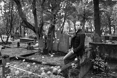
This location was very close to the first, and uses all natural light. This is the main cemetery of Reykjavik, and it is an incredibly peaceful place. There are trees planted on most graves, and since the cemetery itself is about 150 years old, some of them are quite large. It's the most dense large forest in the capital area. This location was the hardest to scout. I wanted to capture the depth of the forest, and the serenity, without it being too cliche as a cemetery portrait location. I wanted peace, not morbidity. This tree was one of the more dense in it's foliage, and as such created the darkest area of the cemetery. I knew if I put the subject under it and facing out, I could get some nice soft light with decent shadows on the side facing the tree. We took a few shots of him looking toward me, but I had him look outward, and his profile looked great. I made sure to line it up so it was on top of the dark branch, to truly show the silhouette, and grabbed this image. It should really be viewed large to really appreciate the details and tonal depth. I love the composition of having the dark side and light side, but his sleeve and face serve as the main light spots in the dark half, properly drawing your eye to the foreground. His sleeve and the tree branch behind his head make a smooth S-curve with his face in the middle. The photo was mainly about the tones and composition, and I felt black and white treatment was more appropriate and would really let me draw out the details I wanted. The main color was the green of the foliage, his outfit was all grey and white, so the color version doesn't bring much.
Here are the other favorites from the shoot, all using natural light.
Settings: Background is properly exposed, flash into 1.5 meter softlighter II to camera right, with the light meter at face level powered to expose properly.
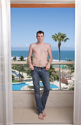
Agust and I went to Puerto Vallarta, Mexico last month. I actually lugged all of my studio lights down there for a photoshoot that didn't really pan out, but I went in knowing that might be the case. I made sure to use them anyway. The above photo used just the 1.5 meter softlighter. One problem is that the outside and inside are such different light types, the outside being harsh sunlight, and me being lit softly, that it looks composited or cut out. The fact they are even in brightness and focus is also contributing. This was intentional, as I wanted the outside to be clear and well lit to show just how nice the hotel and our balcony view was. In addition, it was unavoidable without neutral density filters. to properly expose the outdoors while staying under my sync speed (1/160), I had to go to f/11. This means that foreground and background on a 35mm lens (what I used) would be sure to be both in focus, even with the extreme distance from subject to distant background. If I did want a blurry background, a neutral density filter over the lens would let me increase the aperture. This is also a reason I'm glad I have the power of the Quadra, as I needed about 3-4 hotshoe flashes worth of power to equalize subject and background.
One thing I could have done, and did do for a later shot, is add a rim light. By adding a hard rim light, it reads visually as the sun coming onto the subject, which unifies the lighting, making for a less composited look.
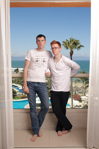
Settings: Background is overexposed by half stop, flash into 1.5 meter softlighter II to camera right, with the light meter at face level powered to expose properly. 2nd flash through reflector with 20 degree grid behind subject to camera left, also properly exposed.
This blends much better with the outside exposure. The slight over exposure is what you expect from looking out a window, and the harder rim light feels like it could be the sun hitting the subject's head.
With both of us in the image, I wanted to use the window and blinds as framing elements, to show that it's on a balcony. This served as our vacation snap from the trip, and while I knew it would look partially cut out with both fore and background perfectly lit and in focus, I wanted both subjects to be prominent and clear. By using such a large source, I was able to keep it a little back and still get soft light, ensuring both of our heads would be the same exposure despite being different distances from the light. (the closer the source is, the more affect different distances from the light will have because of falloff. If the light was only 20cm away from the closer subject, 20cm between our heads would make 40 vs 20cm, for half the light, but with the light 2 meters away, it was 2 meters vs 2.2 meters, such a small difference as to be unnoticeable)
Post was minimal. Some contrast adjustments, and bumped both the blue and green colors so the sky and trees would pop a bit more.
Settings: Main light through a 1.5 meter softlighter, and is metered to proper exposure at his face. 2nd light is behind a white diffusion panel, aimed into the camera, and meters also at proper exposure.
From the numerous shots of my husband, one might be able to ascertain my affinity for red-heads. I find the features fascinating, the trending toward pale skin, freckles, what the light colored eyebrow hairs do to the reading of a face, and the often green eyes. I just think red headed people are fascinating in their anatomy, skin tones, and differences from the rest of the pigment gamut. I decided to put my fetish toward a new photo series. One might think I'd start with my husband first, but I had an opportunity to shoot a stranger first, more shots will follow in this series.
The lighting goal was to keep the focus on the features. Soft, revealing light, and a pure white background so as not to distract from the features. I kept a slight falloff of focus to give it a sense of immediacy. An all in focus image would have been a bit too clinical. I used my 85mm lens to make sure there wasn't any distortion of the facial features, and a benefit is that at f/3.5 this lens is nearing it's ultimate sharpness, giving crystal clear sharpness to the details in focus.
To achieve this lighting, I used 2 lights, and to get a pure white background, I used a very convenient approach. The first light is in my giant 1.5 meter softlighter, directly over the camera and about even with the lens, placing camera and light about 1 meter from the subject, with the light raised above and aiming down. This provides soft even lighting with some volume from being raised. If it were even with the camera in height, the light would be more flat. Now the kicker, is the 2nd light. I have one of my 1x2 meter panels with diffusion material behind the subject about 1 meter, and the 2nd light is behind the panel aiming back through. This means rather than trying to evenly illuminate a white paper backdrop, I'm lighting up a diffusion panel from behind. This is similar to the lastolite popup white background, but works with my existing equipment. By keeping it a bit behind, I avoided flare. If you pump too much light off or through your white background, you can create a contrast reducing flare. I used the B head from my quadra, so it's half the output of the main light, but since the diffusion panel eats up less lighting than the softlighter, they are even in light output. This results in a proper illumination of the face, and since the diffusion panel is white, proper illumination of it ends up with solid white background.
Post processing was mainly to remove a few tiny blemishes, and really enhance the contrast. I wanted to avoid an over baked look, but really get some details popping. This resulted in a lot of back and forth between curves, and then fine tuning the saturation sliders to make sure the shadows didn't go too burnt in redness. I toggled between color and black and white a lot to make sure I got the full range of contrast, this is more evident in B&W, so by changing over to that you can see how your value range is, then switch back to color to make sure the saturation levels work with your adjustments. The other really important thing is White Balance. Skin tones and hair color is really important for this series, so I had to be absolutely sure of color neutrality. One thing I love about my Quadra is it's color consistency at all power levels, but working on a color calibrated monitor was pivotal to making sure it was perfect.
Settings: Ambient read at f/1.4, and the flash aimed at just her face was at f/1.8
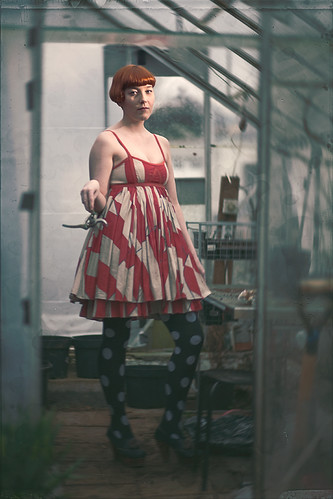
A quick one from this afternoon. My friend Lilja has bright red hair, and always has the coolest outfits on her facebook photos. I saw the polka dot tights and knew I had an image somehow. We were originally going to go into the woods for the shoot, but it started to look like rain. A friend had a greenhouse, and it quickly went from a proposed plan B to the best idea.
I had seen a magazine on the racks here in Iceland with what looked like a tintype image, and I was inspired at the color of the processing, and the faded colors of the image. I knew her bright red hair and the dress we had picked out would survive this processing, and would probably be made stronger because of it.
For setup, I put my black 1x2 meter frame just outside of camera left. This is serving to darken the shadows on that side. The greenhouse was glass on all sides, and it was an overcast day, there was almost no contrast or shadows inside the structure. The black board introduced a bit of contrast, but to properly expose her face, I had to totally blow out the background, which I did not want. I wanted the softest setting of my lens with the shallowest depth of field, so I locked it to f/1.8. At iso 100 and shutter speed of 1/125, this gave me f/2 where her face would be, too bright for what I wanted. Knowing that I was using the light tightly gridded to her face, I could go way above the sync speed.* I bumped the shutter to 1/250, taking the ambient to f/1.4.
Next I put the quadra on a boom, using the grid reflector with a 20 degree grid. This gave me a very tight beam of light, tighter and harsher than my softbox. I wanted to contrast the soft light of the rest of the image, and I knew I was going to use some softening post processing techniques, so the harder lighting would help the face still read when I was done. It was drizzling the entire time, which made me so glad I was using the quadra system, which is largely weather sealed. I put the cable in plug B, and lowered it to the lowest setting of 8.2. This gave me a reading inside the greenhouse where her face would be, of f/1.8, right where I wanted it.
Because of the light meter usage and the tripod to find my exact camera angle, once the model came out it was very fast. I directed her pose, (as an aside, I cleared the view of all modern day looking things like plastic bags of dirt and colored buckets, always control your scene), had her tilt her head in the direction I wanted, and fired a test. I could see the light was not far enough around to give me narrow lighting, it was more like a rim light, so I moved the boom to be closer toward me, and it hit both eyes for the look I wanted. We were done with the actual shooting bit within 10 minutes.
For post processing, I new I wanted to absolutely destroy the corners. First I used a lens blur set fairly low, and masked her out roughly. The items within the greenhouse were too contrasty and pulling focus from her, and this helped clear it up. Next I used a radial blur to really smear the corners the way a crappy lens does. I completely masked it away from her face though. Next I did a lot of color stuff. I made the shadows bluer, the highlights yellower. I made a blue/green layer that only went on the low shadow tones, but not the blacks. Then I made a desaturated green layer, set it to lighten, and only let it touch the deep blacks, effectively taking away the contrast of only the low end of the image, a typical look of antique photos. Finally I found a stain texture and a glass plate texture which I overlayed lightly to give it a bit of texture as if it were on paper. The whole goal was a contrast between a high quality center, with destroyed edges, and a desaturated fatigued look of the colors, with her hair and dress still shining through by virtue of their saturation.
*once you go above your maximum shutter speed (on the 5D it's 1/200, but with a skyport it's effectively 1/160 because of delay) you start to see the shutter blocking the flash on the image. however, that's only on the lower part of the frame, and it gets progressively higher in the frame the higher you go over the sync speed. If the area where the flash is hitting, is high in the frame, you can disregard the shutter creep shadow, because it's not evident anyway. In this image, her face is the only part getting flash, and it's "high" in the frame. I would have probably had to go to 1/320 to start to see the shutter creeping onto her face and blocking the flash.
Settings: Face light is proper exposure, right rim is one stop above, left is about a half stop above.
I attend a Kettlebell class at a gym called Mjolnir (the name of Thor's hammer in norse mythology). The gym really loves having masculine aggressive imagery up, but I noticed that all of it was from foreign athletes, despite numerous staff members, as well as attendants, being just as muscular and photo worthy. I love Iceland, and any chance I can get to promote internal imagery rather than importing stuff made elsewhere, I try to encourage it. I decided to pursue a shoot with them, and do a test shoot before hand so that they would need to do very little imagination to see how it would come out.
Settings: Face light is proper exposure, right rim is one stop above, left is about a half stop above.
I knew I wanted rim light for the revealing effect it has on muscles, but I also wanted to light the face. Before going into the lighting, here is the setup shot. Click through to flickr to read the notes.
The main light is my standard 30x40 XXS softbox with a 20 degree grid to keep it just on the face. This is reading f/4 with the light meter, and my aperture is f/4. So the face is going to be properly exposed. The 2nd light is off to the side, it's shooting through the white diffusion panel, but also past it (you can see the edge on the floor where the light is spilling) and bouncing off the reflector. The rim is reading f/5.6 on the right side (for one stop over) and f/4.5 on the right for a slight over exposure. I would love to keep them even, but the light has further to go when bouncing off the reflector, and loses some light because of the inverse square law (double the distance, quarter the intensity). If I had a longer cable, I could bring the light way further back, to keep the distances more similar, but the cables were already at their limit. Having a light meter really helped a lot to be able to ensure proper exposure, and making sure my rim lights were coming out brighter than the main, and by how much.
For this one I sprayed him with a water spritzer to get a sweaty look going.
For the actual shoot, I am going to run both lights through diffusers to get even, smooth rim on both sides. To keep from getting skunk lighting on the face (a dark black line down the center) I will just put a silver reflector disc on a boom arm for some slight fill. I much prefer the rim look, and lighting the face too evenly removes the constrasty affect from the muscles. I'll post them when they're done.
Settings: Ambient is effectively gone. Not sure the ratio between the two flashes, but the output is 2:1, the main on the face double the brightness of the side light. The main is in a less efficient modifier, but it's also physically closer. I'd say side is 1 stop over neutral grey, and the main 1.5 stops.
This is a first shoot for a couple of techniques for me. It's my first real shoot using the giant panels I reviewed in the past post. I really like how soft the quality of the light is. Works great as a fill with the small softbox acting as my main to draw attention to the face. This is also the first time I worked with a remote shutter and the camera on the tripod. This was immensely freeing for directing the subject, and I could really focus on connecting with him, instead of hiding behind the camera. I was able to be closer to him physically, for a more human interaction as well.
Here is the setup shot. Click through to the flickr to see notes over the different lights:
Real quick rundown. The Quadra pack is a 2:1 asymmetric pack. The small softbox is in the A head, getting double the output of the side light that is aimed into the panel. This is as full as I could fill the panel without serious spill on the background, but I would have preferred to fill all of the panel for a more soft and even light. The main head is in my 30x40cm XXS softbox with the 20 degree grid. This keeps it right on his face, feathering off down the torso, and the grid keeps it from spilling on the background. The 2nd panel is providing a reflector to keep the shadows from going pitch black. I could bring it closer to fill them more, or further to create more contrast. Without that 2nd panel all together, the shadows would have been jet black.
This barndoor solution isn't working yet. The default reflector is just too wide angle, so even with the barndoors closed almost completely, it can spill out over the edge. I'm in the process of buying the 18cm reflector which will give me more control.
I was able to set everything up in about 30 minutes, including the background (borrowed from a friend). Since I was working with a tripod and remote trigger, I was able to test the lighting on myself before the subject came, but I'm looking forward to next week when I'll finally have my light meter. My settings will be much more accurate from then on out, as so far I've been guessing at ratios. Once he came I fine tuned the placement of the softbox. I have wheels for my light stands, but didn't bother to bring them this time, and I really wish I had at least brought one set, as positioning the boom stand with the softbox was a pain without them. I also need to make a small strap for attaching the quadra power box as my boom counterweight.
The shooting session went really well with the remote trigger. He had never been in a shoot before, and was a little unsure, but being able to be close and use full hand movements and body language to show poses and communicate was a real positive. I don't like working at f/8, as the background didn't need to be in focus, this was at f/4. This enabled me to use the pack power really low, like at 80 watt seconds for the main, giving me insane recycle times. I never had to wait, it was always ready for another pop. That enabled me to get some really great mid emotion shots like this:
Working with modeling lights is really great, for those readers who only use speedlights. For perfect placement of the light, especially on the far eye from the light source, it's really key. This specific shot relied on very carefully directing the turn of his face to be just right:
Even just the two preview videos can teach a ton. Sadly the lightform brand is no longer sold, so I was hunting around for what the most equal equivalent is. It seems that Calumet's light panels are the most similar, but made out of aluminum rather than PVC. Since there is a Calumet in Dusseldorf, I purchased 2 frames, 2 diffusion fabrics, and 2 clamps. I plan to make my own black/silver version, but fabric store white fabric can introduce unwanted color casts, so I wanted to purchase the official diffusion fabrics, which were also the cheapest. The photos online aren't so great, and I couldn't find any reviews, so this is serving to show how the system works with closeups.
Panel frame itself:
It's made out of thin aluminum tubes, very lightweight, the whole thing probably weighs less than 2kg. It has a shock cord running through it, and square indents that keep it from being able to twist, which adds extra rigidity. It does not flex in the middle like the PVC versions. You can assemble it just like the frames in the Dean Collins videos, but they don't shake together quite as easy. Maybe after some more usage, but it's easy enough.
The Clamp:
The clamp is identical to the one in the videos, with the added benefit of having a clamp that really holds onto the tube. It can be clamped to almost any tubular surface, it rotates, and the middle T-bar can be screwed tight to the holder to clamp the angle tight, not allowing the frame to rotate. One alone is not sturdy enough to hold the frame from the side, but if you clamp it to the top of the frame, you can hang it and it's secure. It's more likely to use two, one on each side of the frame.
The diffusion fabric:
It doesn't completely even the light, as you can see when the panel is severely under exposed, but I haven't found it to affect illumination of the subjects at all. If you photograph it so that the flash isn't directly visible, as in the 2nd image, you get a fairly even soft white light. I also bought the double clips, and can clip both of them together, with diffusion panels on both, for a giant 2x2 meter wall of soft light. Unless the flash is positioned perfectly, you cannot see the light leaking between the two panels, meaning you never have to worry about a line of undiffused light shining through when using them clipped together. The fourth photo shows the panel from the flash side, showing that while the material is thin, it can be used as a reflector, no real need to buy the white fabric panel. I plan to make a double sided black/silver panel, and I would put the silver side on the other of the white, for a more efficient bounce. The 5th final image shows a real white reflector to show the difference in bounce efficiency. The real white fabric would most likely be more reflective, but it's quite expensive, and only comes with either gold or silver on the opposite side. If they made a double sided black/white I might have bought it.
Examples:
The two panels together give incredible soft light, in fact I have a 2x2 meter window in this same room, and the lighting is near identical in terms of it's directionality and softness. Now I can reproduce it at will at any time of day.
Even when I backed the subject up quite far, these panels are so large they still produce quite soft light. this is probably 3 meters from the panels.
This was a quick test to see how they would work as reflectors. Obviously the harsh bare flash is not flattering on the subject, but you can see a nice bit of bounce filling in the shadows, especially on the side of his temples.
These last two show how reflections are treated. Even with the hot spot, it seems to reflect as a solid white surface, which is great for revealing shape, and the large size keeps it from blowing out to a pure white highlight.
Use this link to show the different products from the Calumet panel line. I bought the large 107x198 cm panels, and the white diffusion that goes with it, plus two clamps, but they have kits as well.
The main problem I have now is not having barndoors that fit the quadra reflector. I intend to look around a bit, and even try a DIY solution I have cooking. Barndoors enable to you keep the light only to the diffusion panels, rather than spilling past to a background or the ceiling.