
Settings: Ambient was all over the place, the lightbulbs almost clipping and the shadows near black, but it was a neutral exposure with no flash. Flash at 2 stops over neutral grey providing the rim light on his shoulders and hair.
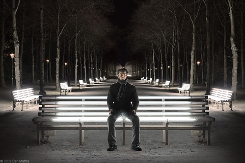
Above is the final composite, click through for large.
Below is the animated gif of all layers, with images brought in fully, then the next frame showing the masks applied to cut them out.

- First was to get the main background plate more symmetrical. The benches were slightly offset, so I evened up the front most bench. The farthest two benches on the left were broken (not illuminated) so I cloned over the benches and lit tree trunks from the right side.
- Darken the farthest trees so it would fade well into the next layer.
- Comp in 2nd photo of the same benches, but I was further away. This required scaling the image way down and careful placement to make it fit.
- Color correction for the main background plate.
- Using an exposure layer, I boosted the foreground path, and then comped in some empty ground from one of the bench shots with no subject. It was made by copying just the ground in front of the bench, then duplicating it, and flipping it vertically to be now above, doubling the height of the lit ground, then using perspective scale matched to the perspective of the bottom chunk. Then I used the clone brush to get rid of the seam or any other identifying details you saw near the flipped edge.
- Add in fake shadow from the bench using another exposure layer set to reduce exposure.
- Pull in the bench, then mask away the dark background. I mainly used the marque selection with a 1 pixel feather built into the setting (only CS3 and above). I used a magic lasso for the non geometric bits, and a paintbrush to clean up, working in the mask.
- Bring in the subject and arrange him in place, mask him out using magic lasso and then a brush for cleanup.
- Exposure and contrast boost on his face. I liked this body pose and another face, so I comped that together also.
- Final color correction on all layers.
I found a new trick for matching White Balance on separate layers, and that's to make a Hue/Saturation layer at the top of the image with saturation set to 100%. This makes color discrepancies really obvious and can be turned on and off by hiding the layer.
In the end, the final composite looks very similar to my original vision I had in my minds eye. Shooting everything at the same time and in the same lighting conditions, as well as with similar standing heights and angle the camera is aimed will make sure these composites work. If the lighting is lying between layers, or the perspective radically different, your white balance matching and perfect masks won't have any affect on unifying the image.

Great work and visual gif!
ReplyDeletethanks to you!