Sunday, January 17, 2010

light_panel_review

Calumet Light Panel Review

For anyone who has not watched the Best of Dean Collins lighting dvds, I cannot recommend them highly enough. Here is a preview video:


Order them here.

Even just the two preview videos can teach a ton. Sadly the lightform brand is no longer sold, so I was hunting around for what the most equal equivalent is. It seems that Calumet's light panels are the most similar, but made out of aluminum rather than PVC. Since there is a Calumet in Dusseldorf, I purchased 2 frames, 2 diffusion fabrics, and 2 clamps. I plan to make my own black/silver version, but fabric store white fabric can introduce unwanted color casts, so I wanted to purchase the official diffusion fabrics, which were also the cheapest. The photos online aren't so great, and I couldn't find any reviews, so this is serving to show how the system works with closeups.

Panel frame itself:


It's made out of thin aluminum tubes, very lightweight, the whole thing probably weighs less than 2kg. It has a shock cord running through it, and square indents that keep it from being able to twist, which adds extra rigidity. It does not flex in the middle like the PVC versions. You can assemble it just like the frames in the Dean Collins videos, but they don't shake together quite as easy. Maybe after some more usage, but it's easy enough.

The Clamp:


The clamp is identical to the one in the videos, with the added benefit of having a clamp that really holds onto the tube. It can be clamped to almost any tubular surface, it rotates, and the middle T-bar can be screwed tight to the holder to clamp the angle tight, not allowing the frame to rotate. One alone is not sturdy enough to hold the frame from the side, but if you clamp it to the top of the frame, you can hang it and it's secure. It's more likely to use two, one on each side of the frame.

The diffusion fabric:


It doesn't completely even the light, as you can see when the panel is severely under exposed, but I haven't found it to affect illumination of the subjects at all. If you photograph it so that the flash isn't directly visible, as in the 2nd image, you get a fairly even soft white light. I also bought the double clips, and can clip both of them together, with diffusion panels on both, for a giant 2x2 meter wall of soft light. Unless the flash is positioned perfectly, you cannot see the light leaking between the two panels, meaning you never have to worry about a line of undiffused light shining through when using them clipped together. The fourth photo shows the panel from the flash side, showing that while the material is thin, it can be used as a reflector, no real need to buy the white fabric panel. I plan to make a double sided black/silver panel, and I would put the silver side on the other of the white, for a more efficient bounce. The 5th final image shows a real white reflector to show the difference in bounce efficiency. The real white fabric would most likely be more reflective, but it's quite expensive, and only comes with either gold or silver on the opposite side. If they made a double sided black/white I might have bought it.

Examples:


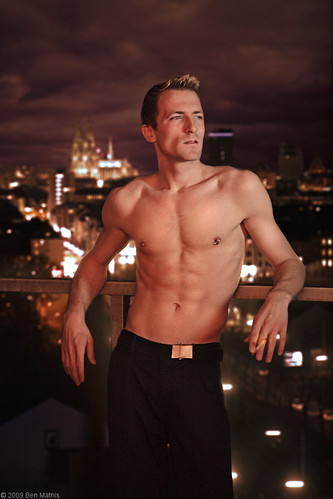
The two panels together give incredible soft light, in fact I have a 2x2 meter window in this same room, and the lighting is near identical in terms of it's directionality and softness. Now I can reproduce it at will at any time of day.


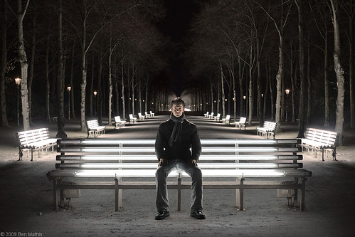
Even when I backed the subject up quite far, these panels are so large they still produce quite soft light. this is probably 3 meters from the panels.


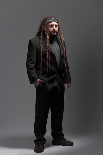
This was a quick test to see how they would work as reflectors. Obviously the harsh bare flash is not flattering on the subject, but you can see a nice bit of bounce filling in the shadows, especially on the side of his temples.


These last two show how reflections are treated. Even with the hot spot, it seems to reflect as a solid white surface, which is great for revealing shape, and the large size keeps it from blowing out to a pure white highlight.

Use this link to show the different products from the Calumet panel line. I bought the large 107x198 cm panels, and the white diffusion that goes with it, plus two clamps, but they have kits as well.

The main problem I have now is not having barndoors that fit the quadra reflector. I intend to look around a bit, and even try a DIY solution I have cooking. Barndoors enable to you keep the light only to the diffusion panels, rather than spilling past to a background or the ceiling.

Tuesday, January 5, 2010

second_light

new_years_2009-4

Settings: Ambient is gone, main is from the small softbox with grid on camera right, 1.5 stops above neutral grey, and fill is from a large 110cm silver umbrella almost directly behind the camera even with neutral grey.

For Christmas my husband (that's him above) got me a 2nd S-head for my Quadra. I can now use 2 lights again. It was freeing having only one for a while, and I imagine I'll still use just one for a lot of photos, but now I can bring in two when I need it.

This was a quick test with using it, as well as a long term series I want to do. A mugshot of each of us every year at New Years (our engagement anniversary). I got the idea from another family that did this from the 70s through the 2000s, including when they added their kids in. I forget where I got it from, but you can see the sequence here: http://www.poopinmymouth.com/wip/age_family.gif I have a long way to go to get that far, but it's good to have some extremely long term projects.

new_years_2009-9

Settings: Ambient is gone, main is from the small softbox with grid on camera right, 1.5 stops above neutral grey, and fill is from a large 110cm silver umbrella almost directly behind the camera even with neutral grey.

If you look closely in the eyes of the large version, you can see the placement and relative brightness of the two mods. The umbrella is the dimmer fuzzy one in the center, and the softbox is the square in the upper right of the eye.

I've been studying Dan Winter's work, and I love how he controls the shadow density with a ringlight. I'm not a fan of actual ring lights, but the principle of using an on axis fill (something strobist fans will be familiar with) is really appealing. Right now the Quadra can only do a 2:1 ratio, so I can only play with distance, but I plan to build some mesh covers that give me 4:1 and 8:1, as well as letting me drop a single head even lower than the current minimum of 8.2 watts. By placing the umbrella directly behind the camera as a fill, every surface you can see gets light. This way you can keep your shadows from going black. If you move it off to the side, you run the risk of creating pockets of shadows which normally looks awful. Fill goes on axis, or as close as you can get without coming into view of the camera.

One thing I really like about this, is that I still have my super contrasty main light, my small softbox with grid, but I can keep the shadows under control even in an indoor environment. Most of the time I use ambient as my fill when doing outdoor stuff, but now I can bring it in even indoors easily.

Wednesday, December 23, 2009

pepe_portrait

pepe-1

Settings: Ambient was completely underexposed, 3 stops or more. Large white softbox from camera left at neutral grey, and small gridded softbox from above and to camera right at +1.5 stops over neutral grey.

This one was a little different than most of my stuff, being that it was a real studio shoot rather than a location based outdoor shoot. I was inspired by a real life lighting situation. I was riding the train, and sitting in one of the small glass booth partitions. It had a glass back wall behind my head, which let in the bright soft light from the main car to provide a dim fill, and a spotlight embedded in the ceiling lit up my forehead and cheekbones while leaving my eye sockets relatively dark. The reflection on the window behind me gave a brighter background to show the silhouette of my face. I knew I wanted to use this lighting setup, but it would require more equipment than I have.

Luckily a coworker allowed me to borrow his grey seamless background, a hensel studio flash and giant 1x1.2 meter softbox. First step was to setup the seamless, fairly easy, just two stands, a cross bar and a roll of paper. I have to get me one of these. Next was his softbox. I kept the power as low as it could go, because it was a 1,000 watt unit compared to my 400 watt running the small softbox. The large one was to keep anything from going black, to illuminate the background, and cast a nice soft shadow onto the background, anchoring the subject.

I set my camera to iso 100, 1/125 and f/5.6 to get sharpness and enough depth of field. I was using an 85mm lens to get rid of any distortion from being a full body shot, and to make sure I only got grey seamless background. (longer lenses compress the background, shorter lenses show more, subject size staying the same) The background was featureless so there was no room to isolate or try to over increase dof. The softbox had to be boosted just a tad to get the right lighting on the face. Most of this initial time was spent with my friend acting as assistant (more on this later). I had to move the softbox forward, closer to the camera axis to get the light to fall correctly and fill both eye sockets. I also kept it about 3 meters back to evenly light him and the background without too much severe light falloff. The dark color of his suit, and the lightish grey of the background paper is what gives the nice silhouette outline. The softbox adds just a bit of volume to the suit, but it's too low to brighten it fully. The grey paper background reflects a lot more, giving a good tonal change. The soft shadow on the background paper is from the large softbox.

Once the fill softbox was dialed in, I added my small 30x40cm softbox with 20 degree grid to a boom, directly in front of the subjects face, about 2/3 of a meter above the head. I wanted the light to hit his face, but only on the forehead, and cheek ledges, not fill in his eyes. This would give me several things key to the look: Deep eye sockets, falloff from head to toes bringing attention to the face, soft edged shadows from the apparent size of the softbox being so close to the face. Without the giant fill softbox, the eyes would have gone way too dark, and had no catchlight, making a much more sinister look. The bright area around his feet are from the beam of this overhead softbox.

I really like how clean the final result came out without looking too soft or safe. It has some edge and contrast to it, with a clear focus point of his face, and nothing important getting lost.

Thursday, December 17, 2009

shoot_walkthrough_part_three

florian-1

Settings: Ambient was all over the place, the lightbulbs almost clipping and the shadows near black, but it was a neutral exposure with no flash. Flash at 2 stops over neutral grey providing the rim light on his shoulders and hair.

Above is the final composite, click through for large.

Below is the animated gif of all layers, with images brought in fully, then the next frame showing the masks applied to cut them out.


  1. First was to get the main background plate more symmetrical. The benches were slightly offset, so I evened up the front most bench. The farthest two benches on the left were broken (not illuminated) so I cloned over the benches and lit tree trunks from the right side.
  2. Darken the farthest trees so it would fade well into the next layer.
  3. Comp in 2nd photo of the same benches, but I was further away. This required scaling the image way down and careful placement to make it fit.
  4. Color correction for the main background plate.
  5. Using an exposure layer, I boosted the foreground path, and then comped in some empty ground from one of the bench shots with no subject. It was made by copying just the ground in front of the bench, then duplicating it, and flipping it vertically to be now above, doubling the height of the lit ground, then using perspective scale matched to the perspective of the bottom chunk. Then I used the clone brush to get rid of the seam or any other identifying details you saw near the flipped edge.
  6. Add in fake shadow from the bench using another exposure layer set to reduce exposure.
  7. Pull in the bench, then mask away the dark background. I mainly used the marque selection with a 1 pixel feather built into the setting (only CS3 and above). I used a magic lasso for the non geometric bits, and a paintbrush to clean up, working in the mask.
  8. Bring in the subject and arrange him in place, mask him out using magic lasso and then a brush for cleanup.
  9. Exposure and contrast boost on his face. I liked this body pose and another face, so I comped that together also.
  10. Final color correction on all layers.

I found a new trick for matching White Balance on separate layers, and that's to make a Hue/Saturation layer at the top of the image with saturation set to 100%. This makes color discrepancies really obvious and can be turned on and off by hiding the layer.

In the end, the final composite looks very similar to my original vision I had in my minds eye. Shooting everything at the same time and in the same lighting conditions, as well as with similar standing heights and angle the camera is aimed will make sure these composites work. If the lighting is lying between layers, or the perspective radically different, your white balance matching and perfect masks won't have any affect on unifying the image.

Saturday, December 5, 2009

shoot_walkthrough_part_two


This is a super quick mockup, sloppy layer masks, no real color correction, but it lets me preview the final result and see what sizes and where I need to focus my retouching on.

You can see the layers in the animated gif build up below.


I like the general layout. I'm going to have to work on the perspective of the front bench, clone in some ground so that the ground below the front bench doesn't fade into green grass, but into more dry dirt path, color correct, fix the masks, and balance the values of the different layers so that his face is still the focal point.

shoot_walkthrough_part_one

A friend of mine mentioned that there are fluorescent tube park benches near my work in Dusseldorf. I knew I wanted to do a shoot there, and struck out on a research trip during lunch. The park benches were cool but there wasn't much behind them providing interest. I knew I'd need to do a composite of some sort. I was pretty sure the park benches would make a nice scene when looking down the lane with them on either side, and there was an interesting building in the background as well that could be used.

Once I arrived with my subject, we focused first on getting the shot I wanted of him. I like symmetrical poses, but I wasn't absolutely sure of what I wanted, so we shot several, focusing on his leg position, how slouched or straight he sat, and whether he looked directly at me, or off to the side. I plan to roughly mock out the final comp with my 3 or 4 favorite poses and see which one feels right.

These are my initial shots in lightroom, no post processing yet. I imported the entire shoot, and went through adding one star to all the ones I thought had promise, or the best background plates for the final comp. Then I turn on ratings with only one star, so that all the rest are hidden and I can focus on these.


You'll notice that most of the poses are similar with slight variations. I won't know which one is best till I mock up the final comp and see how it feels. The background plates show that I got a clean shot of the bench with no light stand or subject, and then a few views of the park benches to pick from. The building will most likely be so blurred in post that it's ok there are some cars and pedestrians, but in all the shots I waited till the scene was empty of people as much as I could.

Monday, November 23, 2009

sebastian_balcony_portrait

seb-1

Settings: Ambient is around neutral grey, with the flash modeling light one stop over neutral grey.

This is my friend Sebastian. He told me he had an awesome balcony with a view of the city of Cologne, and he wasn't lying. While visiting with him, he went out to smoke, and it gave me this really cool vibe of him out there, and I felt like doing a Marlboro man-esque shoot with him there.

I knew before the shoot it was going to be difficult. The city is way in the background, so keeping them both in focus even on a bright day would be hard, at night even harder. Even just letting in enough light for proper exposure was an ordeal. This was taken at ISO 1600, F/1.8, and 1/30 of a second on an 85mm lens. The light was so low, using the flash was out of the question, so this is just the modeling light from the Quadra, a 20 watt LED that is daylight balanced.

I used the softbox without the inner baffle to let through as much light as possible, but used the fabric grid to restrict the light to his face, with some falloff towards the body. To get a good balance, the light is about 2 meters from his face on the right. Then I turned on the lights inside his flat, which were tungsten bulbs, to provide some fill, that's where the orangeish light is from.

With the camera cranked to maximum light gathering mode, I was able to properly grab an exposure of him with the city. The only problem is that the city was super blurry from the 1.8 aperture. I solved this by moving him and taking another photo of the city in focus, so I could blur to taste in Photoshop with the lens blur filter. I wanted a little blur to isolate him as the subject, but not so much that the church was unrecognizable. By masking him out first, I was able to blur to the exact amount I wanted, which was not much. I'd say this is the equivalent of the same photo at f/8 or so, which would have required a camera with iso 12,800 or so.

In post I first did some body editing, using liquify to change the profile, and dodge/burn to sculpt in more muscles. Then I masked him out, quickly with the magic lasso tool, then cleaned up with the brush using a layer mask. I added clouds to the background from another shoot, since the sky was empty, collapsed it, then blurred the collapse layer, blending the skyline and clouds perfectly. Then I used my masking trick from this post: http://mr-chompers.blogspot.com/2009/08/maskingtrick.html to blend the border of him in so it wasn't so obvious he'd been cut out.

Here you can see the stages of editing. The final stage is multiple small things, from enhancing the intensity of the cigarette, to adding some fresnel glow on his silhouette to imply the city lights, to the masking trick, high pass sharpening, and a final color grading to unify it all.