Wednesday, October 20, 2010

Noise Reduction


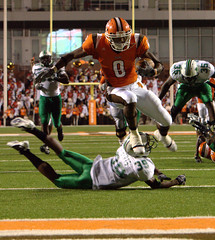
I wanted to share my noise reduction techniques. I don't personally like a lot of noise reduction, because noise can imply sharpness, but there are a few times it's necessary because of how extreme and attention drawing it can be. Above is the final image after denoising. Here is the original:
P1185792

In order to really show the steps, I've cropped in to the center area so I can show you the results at 100% 1:1 pixel ratio. Here is the original image with no luminance noise reduction. I like Lightrooms color noise reduction, and leave it on 7 for up to ISO 800, and up it to 12 for ISO 1600 (your camera will require different settings, slide till the color noise becomes un noticeable).


Next, I duplicate the entire layer, and use Filter > noise > reduce noise and slide it to maximum affect, with sharpening at zero. The image is a bit mushy but has a lot less noise.


Next, I use the layer itself to mask it's visibility. Complicated, but I will try to break it down:

  1. I copy that de-noised layer into the clipboard. (ctrl+a for select all, then ctrl+c for copy).
  2. Then, I add a layer mask, see here for more, and alt+click on the mask so I am "inside" the mask, it will be all white.
  3. I use paste (ctrl+v) to paste the image into the mask. Now you have a black and white version of the layer in the mask. Masks work by showing the rgb of the layer when the mask pixels are white, and hiding when black, with opacity varying by the shade of grey. The problem is that when you paste, it will show the dark areas and hide the light areas, and we want the reverse.
  4. Hit ctrl+i to invert the mask.


What this does, is it reveals the denoised layer in the shadows, and hides it in the highlights. The image itself controls the masking. The reason this works is that properly exposed areas (the light areas) tend to show detail better and noise is less offensive. De-noising these areas kills details. However at high-ISOs shadow areas tend to lack detail and have lots of noise, so denoising these areas tends not to have as much of a blurring affect. By using the image itself to mask the noise, you get a perfect light to dark transition of full noise reduction in the shadows, to none in the highlights. You can even paint further into the mask with a brush, or use curve/adjustments for fine tuning the cutoff of noise reduction.


Better, but the dark areas still have too much noise, it's especially evident in the background blurry areas from using a large aperture lens. A normal gaussian blur destroys too much detail, so I use a smart blur. This will vary per image the values you need, but you want to blur to the point all the noise in the smooth pools of solid color disappear, and adjust the other settings to that the details and hard lines of the actual sharp areas remain.


Smart blur however leaves too hard of edges for what we want, so then I do a gaussian blur with a small enough value to just smooth those hard edges created by the smart blur. This results in an image completely devoid of noise, but much less blurry than using plain gaussian blurring to obscure it.


Next, I use the "blend-if" layer blending option to reveal this noise-free layer only in the darkest areas. I covered blend if earlier on the blog. The settings I used are below, but you can easily adjust to taste.


I duplicate the noise free layer a second time, and remove the blend if options so everything is showing, add a mask, and invert so that nothing is showing. Then using my judgement, I use a 40% opaque brush, and remove noise in areas that are glaring in the image. Just look at the whole thing and see where your eyes go to noise wise, and paint into the mask on those areas until it's acceptable. Most of the times it's the areas that are large areas of solid color.


Next, I proceed with my standard sharpening procedures to get the final result.


Tuesday, September 21, 2010

blend_if_blending_options_in_photoshop


Photoshop has some very powerful blending options available. One often overlooked part is the "blend-if" feature, to control what is shown or affected based on the brightness of each pixel either of the current layer, or of the layers below. This video walks you though using the blend-if feature.

The video explains it clearly, but as a visual aid, double click any layer, and this Layer Style dialog box will pop up. The blend-if function is at the bottom where I've surrounded it in a pink box in this image. You can blend-if using the current layer's (the one you double clicked) brightness values, or those of the underlying layer.


Click and drag on the arrow you want to affect, (yellow box) Black arrow adjusts from the dark end, and white from the light end. To separate, which gives you a smoother transition, alt+click and drag on one side of the arrow to separate them. (orange box) This starts the affect at the inner most arrow, and slowly fades to full affect till the value reaches the outer most arrow. If you drag it till they meet, they snap together again and you'll have to alt+click to separate them again.


Friday, September 17, 2010

band_promo_cover_video_tutorial

Fiona-1

Settings: In each individual shot, ambient is underexposed almost completely. There is one flash in a 1.5 meter softlighter over head, it's set to expose properly at head height, and then falls off down the body. There is also a giant 1x2 meter silver reflector angled up, on the ground in front of them, this provides the fill from below. The background plate was taken properly exposed with regular room lighting.

band promo cover compositing tutorial from Ben Mathis on Vimeo.


I said I was going to make a video of my compositing workflow for this shot, and I finally did. (I needed a microphone). I used audacity to noise reduce and normalize the volume, so it should be easy to listen to. The movement through the process is rather quick, so any areas that are unclear, please post a comment and I can do a follow up in-depth video on one of those aspects.

More advanced topics used in the video are covered here: Masks

The background plate was taken with a tripod so I could use f/8 (the sharpest aperture on my camera body and this lens) at iso 100 (for maximum dynamic range). I think the exposure time was 1/10 of a second, far too slow to hand hold.

Friday, July 16, 2010

diCorcia dissection


Marc Jacobs shot by Philip Lorca-diCorcia for W Magazine:

Someone posted this image in a photograph forum I frequent. At first I just posted, I like it, the lighting is so evocative, and clicked post. But last night I realized that was just a cop out art student level critique, and I should go in and explain a bit more in depth and so I did an actual reading of the photo. I'm going to cross post it here.

The turquoise/orange color contrast has always appealed to me, as it's a contrasting color arrangement that doesn't seem to really work with pigments often, but when done with light it's really contemporary and can have a great affect of "volumizing" because of the contrast. The bathroom and closet are orange, the midground of the guy is turquoise, then the girl (is it even a girl? I can't tell at this resolution. It looks like it should be a girl, but the arm is kind of manly) is orange again. This lends a lot of depth to the image by vibrating between the two colors.

The scene itself, kind of a morning after vibe, in an upscale hotel. You can see suitcases in the closet, and the bed style plus photo over the bed says more hotel than bedroom in a house. You can tell it's upscale by the nice photo and fabric print, but the key clue is the closet that is only lit on the bottom where the coats hang, leaving the top part unlit. This also makes me remember that almost every light source is probably an actual flash, no ambient on a production of this scale, so either diCorcia copied it exactly, or had the foresight to engineer this detail.

Every light source is soft except that hitting the man on the bed corner. The fact it's hard, it's rim, and it's blue, gives him a hard, cold and calculated feel, almost remorseless for whatever debauchery he was up to hours previous. You also have the fact that he's dark on a black background, so he would be lost, but the harsh rim light gives silhouette and the hard long shadows on the bed draw your eye to him. You get two strong focal points, the figure in the bed in the bottom right, and him sitting on the edge in the upper left. There are so many compositional elements adding depth to this image.

The whole thing is luxurious, moody, and hints at an entire story. I love it.

Thursday, July 1, 2010

alejandro_lighting_dissection


I really loved the newest Lady GaGa music video (what gay man didn't?) but beyond the tight bodies and amazing costumes and dance moves, was some really phenomenal lighting. After the 4th or 5th watch through I started trying to figure out some of the lighting setups.


First scene that intrigued me was this tight framing of her face toward the beginning. The razor sharp shadows tell me it's a tightly controlled spot light, and it's aimed perfectly so it doesn't hit her head. This gives attention and lighting to her face, but lets the crazy head gear lighting show, as well as the background lighting create a framing device. It gives it a very otherworldly feel by using light in the main portion, then shadow framing it, then light again framing that. Most lighting schemes either leave the subject lit and background unlit, or the subject unlit and the background lit. The times when it is lit > unlit > lit, the ratios are much closer, creating volume but not this level of contrast. The other thing to note, is while the goggles leave a jet black shadow, the nose doesn't leave any. This requires very precise positioning, because if the light was moved up or further to the right, you'd get a very black very hard edged nose shadow from it. This probably also means her face is very, *very* heavily powdered to prevent any specular shine on her skin.


The scene I liked the most, however, is the above. Very difficult lighting to pull off on a scene this size with so many subjects. My best guess is a huge softbox, large enough to cover the entire stage area, probably 10x20 meters, and potentially gridded or with barn doors to prevent spill (the floor going quickly to black is what makes me think this). I think it's a large softbox because of how soft the shading is, and how even it is on each person and no matter how they move throughout the space of the scene.

What is very likely is the size of the space being huge to prevent light leakage from illuminating the background. One thing that gives these scenes their signature look, is the soft overhead lighting, on a pure black background. This is most likely a stage in a large hanger or warehouse. By having the background being far away in all directions, you don't get any bounce contaminating the shadows on the subjects, and you don't get any light on the background, allowing it to go to black.

I liked this look so much I decided to try it out myself.

IMG_7127.jpg

This is my 1.5 meter softlighter directly over head. I have lowish ceilings or I would have put it higher, which would have resulted with similar levels of shading, but less falloff from head down to feet. Because I also have a small room I was working in, the background is actually a black paper background. The setup is similar though, in that it's a soft, overhead source, large enough to cover the subject, but controlled so it doesn't hit the background.

I think again this is a brilliant lighting decision in the original GaGa video, because it's the type of lighting we don't normally get to see. The most often occurring soft lighting is on overcast days, but it then comes from all directions, and backgrounds are also hit, ensuring everything is soft. Sometimes we get soft window lighting in houses with dark interiors, but then that lighting is from the side. It's only in controlled lighting environments that you can get soft overhead lighting, but with dark backgrounds. This gives it a highly elevated distinct look, separating it from the lighting achievable from most music videos without unlimited budgets.

Sunday, June 27, 2010

diy_quadra_cables


The Elinchrom Ranger Quadra comes with 2.5 meter cables in the kit, or when you buy a new head. There is also a 5 and 10 meter cable, but the 10 meter is currently 140 USD without shipping, a ridiculous price for a cable. I managed to hunt down the supplier of the end connectors, the US supplier is Binder USA, and create my own do-it-yourself Elinchrom Ranger Quadra cable. If you want the straight ended male and female like I have used in this cable, you order parts:
99-4226-00-07 Series 693-2 Connector (both images are incorrect on the webpage, but these are definitely the correct part number for what I ordered, copied from my invoice)


Anyone interested in the hunting process, read this paragraph, if not, skip to the next. I asked around as to what these type of cable connectors are called, 7 pin amphenol connectors with a semi-round master key. I google image searched this phrase, and browsed till I found similar images to mine. In these pages I found a reference to a swiss manufacturer of Amphenol connectors, and as Elinchrom is swiss I figured I might have a lead. I then googled for this manufacturer plus amphenol in google image search and found much closer images and found the US dealer. The actual logo on the OEM quadra cables is of this dealer, so I knew I had a hit. I ordered a male and female connector for 12 USD each, plus 3 dollars shipping to a friend who was coming to iceland and brought them.

After I took delivery of the cables, I asked my father in law to create a 7.5 meter cable for me. I wanted to be sure the part worked before I blogged about it. I did a full shoot with it plugged into both A and B ports, using the modeling light, and doing multiple full power pops. It's a perfect copy of the official cable for 30 USD. (he scrounged a cable, and your price will vary based on length, the longer the length that you make, the more you are saving on the official version). He used a cable where the interior wires were the same diameter as the solder points, but since he did it, I'm unsure of the exact wire diameters or if they are multi strand or solid core. The cable has to be 7 wires (6 plus ground) and they are exactly 1 to 1 in connection (meaning male pin 1 connects to female hole 1).


Here are both OEM and my ordered cable ends next to each other.

Again, showing they are identical.


The straight ends are different than the L ends, but they connect, and the straight end looks exactly like the connector on the Quadra power pack itself. These cables use the exact identical part number as the OEM versions, for a fraction of the price if you can solder or know someone that does. They plug into each other, and into the pack itself. I can plug all 3 of mine in for a total of 12.5 meters (7.5 + 2.5 + 2.5). Apparently the only length with no light loss is 2.5 meters. I count this as a benefit as you can bleed lower than the lowest 8.2 watt setting with all 3 plugged together. If you need to use a long cable plus one at full 400watts, just use the 2.5 meter to your 400 watt head, and use your extension cable to get to the 2nd head. This should also give closer to a 3:1 or even 4:1 ratio rather than 2:1 giving you more control over ratios even when you don't need extra length.

*edit* After testing, using just the 7.5 meter cable loses you .2 stops of light. Adding one stock 2.5 meter cable for a total of 10 meters gives you .3 stops of light, and adding another stock 2.5 meter cable for a 12.5 meter length gives you .4 stops of light.

There you have it, a diy quadra cable of any length for a fraction of the cost of the stock cables.


Monday, June 14, 2010

zen_shoot

sindrisvan-3.jpg

Settings: 1.5 meter softlighter to camera left and halfway between subject and camera, aimed at head and centered at head height, about 3 meters from subject. Metered at head to be properly exposed. Background was shutter dragged to come up to proper exposure as well.

I had asked this subject if I could photograph him over a year ago, and it just worked out this weekend to do a shoot. I had some locations in mind, and did a 1.5 hour location scout with my camera, 35, and 50mm lenses. Luckily I did this right before the actual shoot, so the lighting was identical between scout trip and the shoot itself. Doing a location scout is really pivotal. You don't want to feel rushed with the subject or you could miss some nice background elements trying to just find something quick. I pick locations based on "feel" and our eyes can take in a huge field of view, plus we are viewing "live". It takes exploration to find a single view for your camera that encapsulates this same "feeling" that you chose the location for. By having plenty of time by yourself with no lights, just your camera, you can find these views a lot easier. I'm constantly putting the camera up to my eye without taking a photo, just looking how things are compressed and what shows from that angle.

For the above shot, I loved how the trees went back into the background, and the serene feeling of the bare ground with just pine needles. This is a very uncommon setting in Iceland, tall trees like this and bare ground with no grass or weeds. I knew this was spot number one for the shoot. I experimented with different heights of the camera during the scout, and I knew I wanted my 35mm lens so I could see up into the trees, which would necessitate a low angle. The 50mm narrowed the view too much and you didn't get the same sense of height. I wanted a nice soft side light, so I used the 1.5 meter softlighter. I metered for the face, and then opened the shutter until the background came into a nicer exposure, 1/60th of a second. The rim light on his left side is from the bright sky coming through the open area of the tree trunks above, behind, and to the right.

In post, all I did was create a gradient adjustment in Lightroom for the top of the trees, which I boosted exposure by 1 stop, and made a bit more saturated, and added a slight orange color overlay to give it the sunny feel. The left side of this copse of trees had a road, where people were walking and cars driving, so in Photoshop I duplicated the layer, flipped it, and masked in just enough to show bushes on that side as well. I left as much of the original trees as possible to keep it from looking mirrored. I also made an adjustment layer for the ground, darkened it slightly and added more red so it wasn't so yellow.

sindrisvan-1.jpg

This location was very close to the first, and uses all natural light. This is the main cemetery of Reykjavik, and it is an incredibly peaceful place. There are trees planted on most graves, and since the cemetery itself is about 150 years old, some of them are quite large. It's the most dense large forest in the capital area. This location was the hardest to scout. I wanted to capture the depth of the forest, and the serenity, without it being too cliche as a cemetery portrait location. I wanted peace, not morbidity. This tree was one of the more dense in it's foliage, and as such created the darkest area of the cemetery. I knew if I put the subject under it and facing out, I could get some nice soft light with decent shadows on the side facing the tree. We took a few shots of him looking toward me, but I had him look outward, and his profile looked great. I made sure to line it up so it was on top of the dark branch, to truly show the silhouette, and grabbed this image. It should really be viewed large to really appreciate the details and tonal depth. I love the composition of having the dark side and light side, but his sleeve and face serve as the main light spots in the dark half, properly drawing your eye to the foreground. His sleeve and the tree branch behind his head make a smooth S-curve with his face in the middle. The photo was mainly about the tones and composition, and I felt black and white treatment was more appropriate and would really let me draw out the details I wanted. The main color was the green of the foliage, his outfit was all grey and white, so the color version doesn't bring much.

Here are the other favorites from the shoot, all using natural light.

sindrisvan-2.jpg sindrisvan-6.jpg sindrisvan-5.jpg