Monday, November 23, 2009

sebastian_balcony_portrait

seb-1

Settings: Ambient is around neutral grey, with the flash modeling light one stop over neutral grey.

This is my friend Sebastian. He told me he had an awesome balcony with a view of the city of Cologne, and he wasn't lying. While visiting with him, he went out to smoke, and it gave me this really cool vibe of him out there, and I felt like doing a Marlboro man-esque shoot with him there.

I knew before the shoot it was going to be difficult. The city is way in the background, so keeping them both in focus even on a bright day would be hard, at night even harder. Even just letting in enough light for proper exposure was an ordeal. This was taken at ISO 1600, F/1.8, and 1/30 of a second on an 85mm lens. The light was so low, using the flash was out of the question, so this is just the modeling light from the Quadra, a 20 watt LED that is daylight balanced.

I used the softbox without the inner baffle to let through as much light as possible, but used the fabric grid to restrict the light to his face, with some falloff towards the body. To get a good balance, the light is about 2 meters from his face on the right. Then I turned on the lights inside his flat, which were tungsten bulbs, to provide some fill, that's where the orangeish light is from.

With the camera cranked to maximum light gathering mode, I was able to properly grab an exposure of him with the city. The only problem is that the city was super blurry from the 1.8 aperture. I solved this by moving him and taking another photo of the city in focus, so I could blur to taste in Photoshop with the lens blur filter. I wanted a little blur to isolate him as the subject, but not so much that the church was unrecognizable. By masking him out first, I was able to blur to the exact amount I wanted, which was not much. I'd say this is the equivalent of the same photo at f/8 or so, which would have required a camera with iso 12,800 or so.

In post I first did some body editing, using liquify to change the profile, and dodge/burn to sculpt in more muscles. Then I masked him out, quickly with the magic lasso tool, then cleaned up with the brush using a layer mask. I added clouds to the background from another shoot, since the sky was empty, collapsed it, then blurred the collapse layer, blending the skyline and clouds perfectly. Then I used my masking trick from this post: http://mr-chompers.blogspot.com/2009/08/maskingtrick.html to blend the border of him in so it wasn't so obvious he'd been cut out.

Here you can see the stages of editing. The final stage is multiple small things, from enhancing the intensity of the cigarette, to adding some fresnel glow on his silhouette to imply the city lights, to the masking trick, high pass sharpening, and a final color grading to unify it all.

Tuesday, September 29, 2009

lausanne_portraits

lausanne_portraits-2

Settings: Ambient (on the subject) is one stop below neutral grey. Flash is one stop above neutral grey.

This past week I traveled to Lausanne to vacation and attend a strobist meetup. I had a great time and got a chance to photograph two very good models, Sandra and Scott. I was a group leader, and when we were asked if any group wanted to use the library, I volunteered, as it was very bright and sunny outside, and I didn't know the campus we were on. I didn't want to lose too much time walking around looking for a spot. Once in the library, the tables and chairs near the brightly lit windows immediately drew my attention. I explained how that when walking around looking for locations, I use my hand to envision how the ambient light will fall, and how bright the exposure on it compared to things in the background will be. It's much faster than having the camera up and trying to arrange the model. It's like a divining rod for pleasing light.

Once we were all set up, I asked the group if they wanted me to walk through a normal shoot, and they said yes. I'll try to repeat all the steps and explanations here.

lausanne_portraits-1

This first image is the natural light only. I explained my first choice is always lens fov. Because of the location, a wide angle lens would have revealed that this was just a row of tables at the edge of a library, and for the narrative of this photo, I wanted it to feel more like a warmly lit cafe. A telephoto lens would compress the scene to only show the row of tables and give a more blurry background, creating more subject isolation, and a pleasing pattern of all the background patterns.

Step two for me is to figure out ambient exposure. If I'm planning to use flash, I use 1/180 as my ceiling for shutter speed (1/200 is the 5d sync speed, but I can't seem to get my skyport/quadra setup to reliably sync, but it always hits 1/180, and I have my camera set to half, rather than third stop exposure changes, so 1/200 doesn't show up anymore, but 1/180 does). It was really bright in this room so I was able to use ISO 100, 1/125 and f/2.

We noticed that the background really blew out in brightness, so our next step was to try to control the background, and use the flash to augment the existing light. The goal was to get the same overall feel as the ambient only image, but with complete control of background and subject illumination. I doubled the shutter speed to 1/250 to darken the background. This left the face quite dark, but I positioned my softbox in the same location as the window, and powered it up to match. Because I did not want spill on the table, the shutter at 1/250 managed to block the flash from hitting the table, which was a convenient feature.

lausanne_portraits-2

The light is a bit more contrasty and specular than the window light only, but to be honest I prefer it that way. It's not quite as appropriate for women as for men, but she had sufficient makeup on that it worked well anyway. Specular highlights tend to work nicer in bringing out skull structure on men, whereas women look better looking smooth and matte.

Notice how in the ambient only image, the bright areas in the background fight for visual attention with her face. In the flash lit image, we were able to darken the background, add a bit of volume to her face, and bring it out brighter. Now there is no question where the eye should go, directly to the subject's face. With this control we could darken the background even more, or let it bleach out. The flash frees us from the ratio of the ambient only.

Next I wanted to try a different feel. With the crop occurring mid-torso, it has a more relaxed location feel. But since she had very nice legs and a short dress, I felt that a more full body shot would be more beauty/glamor. I asked her to move the chair to the edge of the table so that I could see all of her.

lausanne_portraits-3

Settings: Ambient (on the subject) is even with neutral grey. Flash is one stop above neutral grey.

For this the flash is coming from almost directly in front of her face, perpendicular to the camera. One of the group members asked about how the light would work in terms of reading well, since the ambient light is clearly coming from the other side. I said that since it was an indoor location, there would most likely be interior lights, and having a light source coming from the other direction was ok and would most likely still read well. It was a good question though, as it's good to have your light motivated by existing ambient. It is possible to break the lighting on the subject so they appear not to actually exist in the background.

I also explained that once I have a lighting setup and pose that I like, it's fun to explore around to the different angles, and you can potentially find a really nice image that you hadn't pre visualized. This was one such example.

lausanne_portraits-4

This was the first part of the day, I will cover the second portion tomorrow or the next day.

Sunday, August 16, 2009

journey_in_post_processing

kiril-2

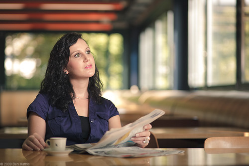
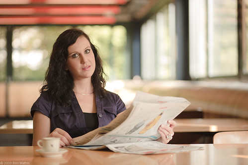
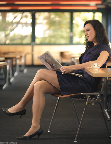
A forum I participate in expressed interest in my workflow of post processing my portraits. This was a recent image I was happy with, so I decided to document my workflow.

For this shot, I worked the way I normally do, in that I find a location first, then arrange a subject and clothing and engineer a lighting setup. I also work backwards from getting my ambient exposure first, and only then adding in flash. My work qualifies as portraiture, but my subjects and their faces are always much smaller in the frame than pure portraiture. I like using interesting environments as framing and compositional elements.

Sometimes this requires compositing, because the environment only has a specific feeling at a time of day where I can't have a model in a helicopter waiting to be drop-flown in.

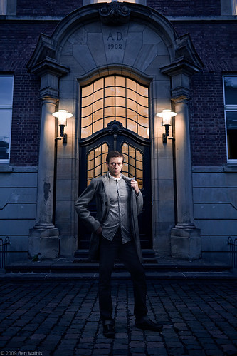
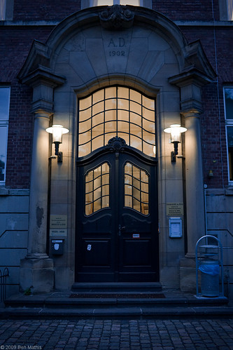
For this particular shot, I saw this doorway while bicycling past one night, and it just had this timeless, slightly victorian feel to me. I made a trip back out a few nights later at the right time period (it's boring during the day) and worked out which lens I wanted to use (I almost always use my 35mm for these type of shots, but I wanted to see if the extra compression of 50 would still get the door in, it didn't) and how far back I need to be, standing or crouched, and where I would put the model to get them the size I want and to be frame properly.

Straight out of the camera original:


First things first. I try to work from a top down approach. Largest changes first, especially things that will move pixels. I like to work in a non-destructive workflow, with layer effects, which means I use a lot of masks. Moving pixels after making a mask, requires you to either re-paint the mask, or to move a merged copy of the previous layers, which is destructive. That means my first goal is to remove all the crap that dates this as a photo from 2009. Garbage cans, metal pipes, placards, etc, all have to go. I purposefully lined up the image to be centered and completely parallel to the film plane. This means I can use uncluttered areas of the left side to cover up clutter on the right.

So I duplicate the whole layer to a new layer, and flip it from right to left:


Next I apply a mask, and invert it. This hides the entire layer. I am now free to reveal the layer by painting into the mask. The next image shows my mask, overlayed onto the original layer. The white parts are where I've revealed the flipped image, essentially covering what's underneath. To recap, I'm covering the original image, with the flipped image, using a mask.


This is just that duplicated and flipped layer, showing only what the mask is allowing to be revealed.


Here is the combination of that flipped info, and the original layer:


This is all the info I can salvage easily. Now I have to clean up manually. I create a new blank layer, use the clone stamp tool, set to "sample all layers" otherwise it can't clone because it's on an empty layer. I now grab info from nearby areas that will cover the remaining metal bits easily. I do this on a new layer, because the normally end up either too bright, or too dark to match the surrounding materials seamlessly, so by having them on a new layer, I can just marquee select and use dodge/burn, exposure, or curves to get it to where it matches the value and color much better. If it still shows some borders, then I break out the healing brush to properly blend together, but this image didn't need it. This is just that empty layer with the clone stamped bits:


And the result of this layer on top of the previous ones:


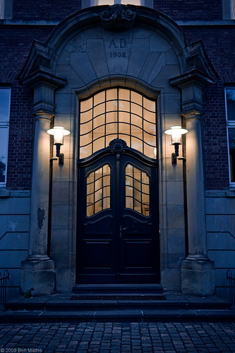
Next I do some sharpening, using the high pass technique I've posted before, as well as a smart sharpen. The final background plate:


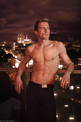
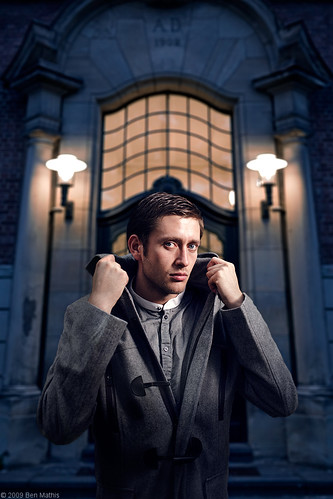
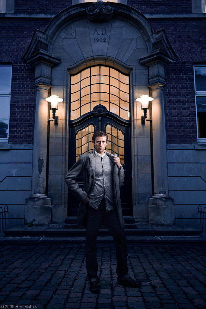
Once I arranged the model and shoot time, we headed out and I took the photo. It was in the same location, but it was much earlier in the day (model was limited on when he could come). This was both a blessing and a curse. The good part is that the higher ambient level opened up the shadows on his face, and it's easy to darken to match the original. The bad news is that right out of the camera, it didn't match at all.


Large things first again. On the subject, the large things are always proportional changes. I often use the liquify brush to lengthen or compress, widen shoulders, narrow waists, etc. For this, I straightened his stance, and used liquify to bring his waist area a bit narrower. I also used some dodge/burn to bring out his pectoral muscles a bit more.


Next, I didn't like how sloppy the hang of his jacket was. It made him look really wide, and it was visually too heavy. I used the lasso tool to grab the hanging portions, and lifted them to a new layer (you can do this with ctrl+j) Then I used the warp transform to make it sit snugger to his body, while still looking like it's hanging. This left some gaps which I filled with just the paint brush tool, color picking from the surrounding fabric and just connecting the gap. Here is just that layer:


Here it is showing on the layer. You can still see the original jacket showing, but it's ok, because I will be masking the background in over top. I will just make it so the mask covers the old jacket line.


Now I bring in the background plate, and position it over the environment correctly. I have made a mask the shape of the subject to hide it where he is. This is why I made all the changes to him first. If I had made this mask, then tried to make his waist thinner, I'd have to repaint the mask, or I'd need to be editing a flattened layer for no reason:


Two things are immediately apparent. First is that the plate isn't wide enough, second is that the color is way off between the two layers. I started by fixing the background to be wide enough. I duplicated the background plate, and killed the mask. Then I used photoshop's "content aware scale" to make the background plate wide enough. Then I put it below the previous background plate, mask away the center really quickly, because all this needs to do is extend the edges:


Their was a seam between the original un-stretched background, and this one underneath. I just painted on the edges of the mask on the top layer to get rid of it and seamlessly blend the two. Now I have the unstretched background with the tight mask around the subject on the top, and the stretched version below:


Now I want to match the lighting on the subject to match the background. I made a new exposure adjustment layer with -4 exposure on it. I put this layer above the subject, but below the background. Now I added a mask, and only painted on it where the subject needed darkening.


This is the mask of the exposure layer. Full white darkens -4 stops, full black does nothing. I left this layer totally away from the face, to keep the night lighting from the flash, and the fill from the ambient, but on the legs, I added it all over, but mostly to the shadow side of the wrinkles and the leg, where the flash didn't reach. This way it simulates what the lighting would be had the ambient actually been as dark as the background. This layer mask probably was the most time intensive of the steps, because I needed the border from leg to cobblestone to be perfect. If it bled onto the pants, I got a black cartoony line, and if it bled onto the cobblestones, they became too bright. I ended up making a new alpha layer with the magic lasso tool to have an easy selection that would give mea nice border:


There was still too much of a separation between the cobblestones and the stairs. It looked too bright to look natural. Check the image 16, two images back. I added another exposure layer, with -1.5 stops, and just gave a quick brush stroke into the mask where the cobblestone meets the stairs, keeping the stroke off the legs, in order to darken the cobblestone where it meets the stairs.


Now the lighting matches, but the color tone is still way off. I added a color balance adjustment layer,which lets you tint your shadows, midtones, and highlights. It's good for split toning, and especially matching mixed ambient levels like this. Once again this is over the subject, and under the background


The highlights I made a bit more yellow, the midtones more blue/green, and the shadows a blueish purple with some green in it. I knew I needed bluer shadows and warmer highlights, but the fine adjustments I had to eyeball till they looked correct, adding or removing one point on these sliders till it matched.


Next I didn't like how the stairs were so bright behind his legs, it made it feel a bit cutout. I made yet another exposure layer, with -1 stop exposure, and did a quick soft paint brush behind his legs to darken the stairs. This layer was set above the background as a clipping layer. This means it can only affect the layer right below it. It makes it so I can be sloppy with the mask, and not worry about it changing the exposure of the subject.


And finally a quick progression gif because some of the stages are minor enough that you really have to see it change over top of the previous version:


Tutorials related to this post:

Masking: http://www.poopinmymouth.com/tutorial/masks.htm

Sharpening: http://mr-chompers.blogspot.com/2009/04/sharpening.html

Wednesday, August 12, 2009

kiril_portraits

kiril-1

Settings: The background was shot separately with ambient about 2 stops below neutral grey for a dark feel and still allowing the lamps to not blow out. In the subject's image, Ambient is 1 stop below neutral grey, and flash is 1.5 stops above neutral grey.

I've posted the original setting, and a closeup of this shot for the previous masking tricks post, but here is the full image.

Having scouted the door location, I knew I wanted to use a male model, in a dress coat. I asked around for my friends, trying to find someone with a look I could use, who also owned a dress jacket with collars that could be held up. I used google images of pea coats and chesterfields when asking people if they owned what I was after.

If I had the full budget of a paid shoot, I would have scouted for a Hugo Boss grey or black double breasted pea coat. I also wanted a double layered undershirt, something white with a low V-neck showing the upper pectorals, and then a button down blue shirt. However when putting together a shoot with a budget of zero monies, you work with what you have.

We arrived at the location, and I set up while the model changed into the wardrobe (it was far too hot out to bicycle there already dressed). I had already scouted the location, so I knew I was going to use my 35mm lens, I knew about where I'd stand as well. The evening wasn't dim enough yet for them to have turned on the lamps, but in hind sight it worked well, because the ambient provided a nice fill on his face on the non flash side that would have been lacking if it was closer to dark.

kiril-3

Settings: Ambient is one stop below neutral grey. Flash is 1.5 stops above neutral grey.


In this photo you can see what the ambient levels were like at the time of the shooting. The flash in all these images is in a 30x40 cm softbox with a 20 degree grid. In this image, it is coming from camera left, through a fabric grid to keep the light only on his face, and not on the door or his knee. You'll notice in all the images the flash is set to a narrow lighting pattern, where the flash hits the front of his face, but leaves the side of the face we can see in shadow. I like this lighting pattern best for how it reveals facial details.

kiril-2

Settings: The background was shot separately with ambient about 2 stops below neutral grey for a dark feel and still allowing the lamps to not blow out. In the subject's image, Ambient is 1 stop below neutral grey, and flash is 1.5 stops above neutral grey.

This image uses the same settings as the first, I've just moved the subject further back, and gotten down on my knees instead of taking at eye level. The background was composited in. The bricks on the ground are from the subject's image, and the background plate had to be extended as it wasn't wide enough. I used photoshops content aware resizing to extend the brick walls without ruining the windows or the doorway. Then I did some reshaping of the jacket, as it was too loose, and then used dodge and burn to give him a bit more obvious musculature. I also slimmed the waist a bit. The hardest part was getting the ambient levels of the subject to match the background, as well as the color toning. The ambient was still quite neutral, whereas on the background plate it had a ton of blue and a bit of purple in the shadows. I used an exposure layer with lots of masking to darken the non flash lit parts to match. Then I used a color balance and a photo filter to tone the ambient to match the background. In the top image, I used Photoshop's Lens Blur filter to add depth of field to the background so that the subject would stand out a bit more.

Before and After:

Monday, August 10, 2009

masking_trick

Masking or compositing a subject onto a background can be really difficult. Too sharp and it looks cut out, too blurry and it looks wrong. I've figured out a neat trick that helps blend the foreground and background. If you're not familiar with basic masking techniques, read my masking primer here.

Click these for full resolution:


Original. Notice background is reasonably sharp, and the edge between jacket and background is rather crisp.


In this one I've brought in a new background. It's the same location, just from a previous shoot where the light was better and the lamps were turned on. I've masked out the model so that the background lines up with his silhouette. The mask is accurate, but it's a bit too crisp, even using the blur tool to smooth the edge a bit.


For this version, I created a merged layer, it's a layer on top of all the previous layers that contains a merged copy of all visible layers. You can do this with ctrl+alt+shft+e Then I ran it through filters > blur > lens blur and choose an 8 aperture blur, and blurred it only 10 units, just enough so that the border between subject and background became natural. The resolution of your image will require different settings to get this accurate.


For this final, I added a mask to the lens blurred layer, and inverted it. This makes all of the layer hidden. Now using a very soft edged brush, I went around just the border where the subject changes to background, and revealed the lens blurred layer. This now gives a much more natural transition where it looks like the edge of the subject is mixing optically with the background.

Tuesday, July 21, 2009

upcoming_shoot

I did a location scout tonight. I've got a pretty good idea now of what subject I want, how they should pose, and what kind of lighting I'll use. I'm pretty excited.

Before shot:

location_scout-2

after:

location_scout-1

I removed all the modern bits, the plaques and metal pipes and trashcan. Not only to make it look more timeless, but also to keep the visual attention up near the lights, where the subject's head will be. It was fairly easy, not too much original cloning. I just duplicated the layer and flipped it horizontally, then hid it all with a mask, and revealed it where the details I didn't want would be. That got rid of 90% of the stuff, then I just needed to clone out a few details, which I did on a new layer, so I could darken and color correct the cloned bits so they would match the background perfectly. I also did some selective sharpening to bring out the grit and details on the bricks and cobblestone, but left it off of any areas that looked too overcooked (mainly around the lights and the window panes).

Monday, June 29, 2009

light, shadow, and specularity

light, shadow, and specularity
Want full control over the light and shadows in your photography? Understanding how light works is necessary, and this paper will attempt to explain how to affect the lighting, shadow quality, and apparent shininess of your subject.


This tutorial is geared toward both 3D artists and photographers. There will be times when I need to make a technical explanation that won't make sense to one group. I'll try to use terms that both groups will understand. All units will be in metric.In this explanation, we're going to focus on the two most important objects in a photo, or a 3d rendering. The light source, and the subject. All explanations will be assuming one light, as it applies to multiple lights identically.


The light source has 4 properties that affect the lighting of the scene.
  1. Apparent size
  2. Distance from subject
  3. Intensity (brightness)
  4. Color temperature

The subject has 2 properties
  1. Surface reflectivity
  2. Surface roughness

We can affect the way the light interacts with the subject, by knowing how these 6 properties interact.
  1. Shadow edge softness
  2. Width of the penumbra (area where light transitions to dark, sometimes called the terminator)
  3. Brightness of specular highlights
  4. Falloff from full light intensity to complete darkness


Light Source
All of the light sources properties are inter related, except the color temperature, which is independent of the other 3.

  • Apparent size
One must specify apparent size, rather than actual size. The sun is humongous, but it's apparent size is quite tiny. A 30x40 cm softbox is considered XX Small, but if it's right next to your face, it's apparent size is large. You can "modify" a light source with a light modification. An umbrella, a diffusion panel, or a softbox are all examples of lighting modifiers. When I refer to the size of the light source, I'm meaning the last surface between the original light source, and the subject. If you put a big translucent diffusion panel in front of the direct sunlight, now the diffusion panel is your light source, not the sun.

As an example. Here is a softbox very close to my good friend, Klaus Nomi:


And the view from his perspective:


now I move the softbox further away:


Now look from his perspective:


Notice how in the last image, the softbox appears much smaller? That is because it has been moved further away. It's apparent size (to the subject) is smaller. The way to keep it's apparent size the same when moving it away, is to increase the size of the light source. In photography, you use a diffusion panel, an umbrella, or a softbox, and just select a larger size than you were using when it was in close.

Larger softbox:


From his perspective:


By increasing the size of the light source, I've kept it's apparent size the same, despite increasing the distance from light source to subject.

  • Distance from Subject
The physical distance from the light source, and the subject. Light works based on the Inverse Square law. If you double the distance between subject and light source, the amount of light reaching the subject will be a quarter what it was. If you halve the distance, the amount of light will be quadruple what it was.

There is a property of light that does not adhere to inverse square, and I will get to that under surface reflectivity. The brief version is that no matter the light's distance from the subject, the brightness of the reflection of the light source stays the same, only the size of the reflection changes.

  • Intensity
The brightness of the light reaching the subject. This can me measured in Lumens, Candelas, Watt Seconds (not an actual brightness measurement, but a reference to the power being used by the flash

  • Color Temperature
Simply, the color of the light. Tungsten bulbs are orange colored. Fluorescent bulbs are greenish. Halogens can be blue or warm. The sun is a bit yellow, the open sky is a bit blue. Most flashes are neutral, but "hot lights" are warm. Sodium Vapor lights (street lights) are the worst, as they are extremely orange, and emit almost no blue wavelengths of light. Most light sources can be corrected for, so that they appear neutral. Add blue, and a orange light becomes white. Add magenta, and a green light becomes neutral. Sodium vapor however, cannot be corrected for to get neutral colors. The easiest way to correct the light, is to photograph something that is neutral in color (a grey card, or a piece of white paper) under that light source. Most photo editing software will allow you to "pick" from this neutral area, and it will subtract any color tint it perceives. This is why it's necessary to use something without color in itself, so that only the color of the light will be present.


Subject
Both the subject's reflectivity and roughness are highly inter related.

  • Surface Reflectivity
A mirror is 100% reflective. The only thing 100% non reflective is special carbon nano fiber fabrics, but for all intents and purposes, the less "wet" or oily a surface is, the less reflective it is. A human eye is highly reflective, as is a wine bottle, a billiard ball, sunglasses, and metal buckles. Most fabric has low reflectivity, as does paper, and rust. Most things fall somewhere between. Human skin, because it is covered in tiny drops of oil, has reflectivity, most plastic is slightly reflective, as is rubber, leather, and rocky surfaces. All surfaces start with a default reflectivity, but it can be altered. Human skin can be either cleaned, or have powder makeup applied to reduce it's reflectivity. Glass can be sprayed with non-reflective spray. Leather can have polish added. Conversely, you can make skin more reflective by adding oil, sweat, or water. Normally it's not a good idea to change the surface's reflectiveness just to change it's apparent shininess. If your model needs makeup, or you want to put water drops on a rose for aesthetic reasons, do so, but just adding powder or anti reflective spray is normally a lot more difficult than controlling the specular brightness, which we'll go into later.

  • Surface Roughness
The surface roughness can be anywhere from glass smooth, to rough like elephant skin. Human skin has texture and roughness, but it's fairly smooth. A wet sphere (like the human eye) is incredibly smooth. Glass vases are smooth, leather purses are a bit rough. Blue jeans are rough, metal is almost always smooth, unless it's brushed aluminum, or rusty. Surface roughness ties in very closely with surface reflectivity. Even if a surface is highly reflective, if it's rough, you will get a more scattered reflection.


Here is an illustration. On the left is a bowling ball. You get one specular highlight from the fact it's just a giant smooth ball. On the right, you have a bowling ball covered in marbles. Each marble has it's own specular highlight, because they make the surface rougher. This is exactly the difference between a smooth and a rough surface. You could also think of the difference between a smooth mirror-ball, and a disco-ball. Human skin has millions of tiny drops of oil, acting like these glass marbles. Black asphalt has tiny grains of sand and rock that are at different angles. A rough surface is essentially a faceted surface, so there is more than one non-contingent area that faces in each direction.


Some objects can have their roughness aligned in a certain direction. Think brushed aluminum, freshly-combed human hair, a Christmas ornament wrapped in thread, or a vinyl record. This roughness is referred to as anisotropy. It will affect the highlight in a way that runs along the rows of roughness. It's best to think of it like the human hairs. Thousands of tiny cylinders all roughly parallel to one another. Each hair has a normal specular like a cylinder, but when seen as a whole, you get a long, narrow highlight. If the exact same surface were perfectly smooth like a bowling ball, you'd get a specular hotspot the shape of the light source. It's the parallel roughness that causes anisotropy.

Example image: (notice how the smooth version is one continuous circle that fades out, the rough version is the same shape, but it's broken up into tiny chunks, the anisotropic turns it into a wide band that wraps around the sphere)

The
way the light interacts with the subject

The entire way the surface is revealed can be controlled by the photographer or render
artist by carefully selecting the appropriate settings.
All 4 properties of light, as well as the 2 surface properties, can be controlled to alter the way the light and subject interact. It's important to know how they interact, for when you desire a specific look for your photos or renders.

First, a quick rundown of the terms for the different parts of light, specularity, and shadow on an object:


The specular hotspot are the bright sharp images of the light source being reflected off the object. They are referred to as hotspots, because in most images, they are overexposed and show up as pure 255 white. The diffused light, is the area of the object being lit by the radial rays from the light source. The penumbra is the edge from where lit area changes to shadow area. This is where the roughness of an object will be most apparent. The shadow is the area not receiving any light from the light source. Unless illuminated by another light or bounce object, it will be completely black.


Shadow edge softness

The edges of the shadows can be razor sharp (like from the sun on a clear, non cloudy day) or super soft and smooth, like on a bright, but overcast day. The main property that controls this, is the apparent size of the light source. Larger apparent sizes create softer shadow edges, smaller apparent sizes create harder edges. The sun, a 3D point or spot light, a hotshoe flash, or a studio light used bare, will all produce completely sharp shadows. This is rarely desired, but when you do want a hard shadow edge, use a small light source. This section also applies to the penumbra, which is explained further into this tutorial.

Here is an illustration for hard edged shadows:


A small light source is binary. The surface of the subject can either see it, or it can't. If it can see it, it's lit. If it can't, it's in shadow. The small source means that the surface will move from lit to shadowed almost instantly, which is why the shadow edge is hard.

Here is an illustration of soft edged shadows:

This results in soft-edged shadows:


A large apparent light source is analog. There are parts of the surface that can see all of the light source, and thus receive rays of light from all of it, and there are parts that cannot see it at all. However unlike the point lights, there is also an area which can see parts of the light source. The less they see of the light source, the darker they will be, and the more they see, the lighter they will be. This gives you a gradient from the area that can see all the light source, to the area that can see none.

The smaller the apparent size of the light source, the harder the shadow edge, and the more it behaves like the point light example. The larger the apparent size of the light source, the softer the shadow edge will be.


Width of the penumbra (area where light transitions to dark, sometimes called the terminator)

The penumbra is controlled almost entirely by the apparent size of the light source. It's slightly affected by the roughness of the surface, and how gradually it turns away from the light. Smaller apparent light sources will create very narrow penumbras, and any surface roughness will be accentuated by all the micro shadows. Any small bumps or dents will have shadows cast. A polished sphere will have a very smooth penumbra since it is not rough, and it turns away slowly. A box has a very narrow penumbra because the surface angle changes suddenly a full 90 degrees, rather than smoothly turning away. Most faces behave like a sphere, and the penumbra should roll smoothly off, but skin with wrinkles or acne scars will show very strongly in the penumbra if your apparent light source is small.

The most flattering light for a rough surface, if you're trying to hide the roughness, is a large apparent light source. This will soften the micro shadows in the penumbra.

Brightness of specular highlights

One thing that has to be explained about specular highlights to truly understand them. Light radiating from an infinitely small point would have no specular hotspot. But all light is originated from something with a physical size; the sun, a flash tube, a light bulb, etc. Each point of this physical light source is casting light out radially. What this means is that there will be parallel rays traveling outwards in the shape of the light source.

The radial rays will fall off, because the further away you get, the more spread the light beams are, and an individual point will be receiving less of these rays. This is why the light "falls off" in an inverse square manner.
However the parallel rays do not fall off. Think of them as tiny lasers, aimed perfectly from the light source itself, onto the object, which then reflects it directly into your eye. Because the light rays are not traveling outwards radially, they maintain brightness regardless of distance. The only decay of the beam will come from the particles in the atmosphere itself, but for any realistic working distance, it will not be measurable.

This illustration shows a very simplified model of this behavior:


Because the light is traveling radially, closer objects get more of the rays, further ones get fewer. This is also why shadows are sharper at the base of an object (like near the feet of a person standing on the ground). Keep in mind that the bulb is there for stylization purposes. You don't actually see a perfect reflection of the light source unless the object is incredibly smooth and reflective. On most objects it just appears as a white shape that is the same shape and dimensions as the light source. (a softbox leaving a squarish shape, and an umbrella a circular shape)


Falloff from full light intensity to complete darkness
As mentioned above, light "falls off" in intensity. You can use this for control. If you put a light source extremely close to a face, by the time it reaches the person's shoes, it will be too dark to register on the sensor. As the distance from light source to subject increases, the less you can use this affect. Best to imagine the sun. Your feet are further from the sun than your head, but it's such a tiny fraction of the overall distance from the sun, that you will get no falloff. If you are 2 meters tall, and the light is 1 meter above your head, and properly bright to light your head correctly, it will be one quarter that brightness by the time it reaches your shoes. This can be used to create focal points where the eye is naturally drawn to.

summary
  • Unfocused light falls off inverse squarely. Double the distance, 1/4 the brightness. Half the distance, 4x the brightness.
  • Surface roughness determines how clearly the light source is reflected. Smooth surfaces give you the exact shape, rough surfaces give you a scattered shape.
  • Apparent size is what's important, not absolute size. A medium source 1 meter away is apparently larger than a giant source 50 meters away.
  • Apparent size of the light affects the softness of the shadow edge and penumbra. Larger apparent sizes make softer shadows and smoother penumbras, smaller sizes make sharper shadows and harsher penumbras.
  • Specular reflections do not fall off. They stay the same intensity regardless of distance. Lessening the reflectance of the surface, or making the apparent size of the light larger, is necessary to lessen the specular hotspot's intensity.
Link to google documents version.